To copy a text style from a website, inspect the text, open the Computed tab in DevTools and note seven values: font family, size, weight, line height, letter spacing, color and text transform. Convert px to rem, make the line height unitless and the letter spacing em-based, then write it as CSS, Tailwind classes or SCSS variables. Font Inspector copies the same style in any of the three formats with one click.
What actually makes up a text style
You see a paragraph on someone’s site and it just reads well. You want the same feel in your own project. The font name alone will not get you there. What you are looking at is a small set of values working together, and you need all of them.
| Property | What it controls | Typical trap |
|---|---|---|
font-family | The typeface, plus the fallbacks used if it fails to load | Copying only the first name and losing the fallback stack |
font-size | How large the text is | Copying a px value that ignores the reader’s browser settings |
font-weight | Stroke thickness, from 100 to 900 | Assuming regular when the site uses 450 or 500 |
line-height | The distance between lines | Copying a computed px value that breaks when the size changes |
letter-spacing | Tracking between letters | Missing it entirely, because it is small and easy to overlook |
color | Text color | Assuming pure black when the site uses a softer dark gray |
text-transform | Uppercase or capitalized display | Retyping the text in capitals instead of setting the property |
Through this guide we will use one sample: body text set in Inter at 18px, weight 500, with a line height of 28.8px, letter spacing of -0.18px and the color rgb(31, 35, 40). Those are the numbers a browser reports. By the end they will look quite different, and much more reusable.
The manual way: read the style in DevTools
Every desktop browser can show you these values with nothing installed. In Chrome, Edge and other Chromium browsers it goes like this.
- Right-click the text and choose Inspect. The Elements panel opens with that element selected. Check that you have the element that holds the text and not a wrapper around it.
- In the side pane, switch from Styles to the Computed tab.
- Type
fontin the filter box to narrow the list, then notefont-family,font-sizeandfont-weight. Clear the filter and findline-height,letter-spacing,colorandtext-transform. Tick Show All if one of them is missing from the list. - Scroll to the Rendered Fonts section at the bottom of the tab and confirm that the first family in the stack is the one being drawn. If a fallback is showing, the numbers you copy were tuned for a different font than the one you see.
Why not copy from the Styles tab?
The Styles tab is tempting because its right-click menu has Copy declaration, Copy rule and Copy all declarations. The trouble is what you get. Styles shows every rule that matches the element, in order of specificity. The font size may come from one rule, the family from body, the line height from a utility class, and half of the declarations are crossed out because something else overrides them. Copying a rule gives you layout, margins and overridden noise along with the two lines you wanted.
Computed is the final answer after inheritance and overrides have been resolved. The price is that everything is resolved to absolute units, so you get 28.8px where the author wrote 1.6. That is what the cleanup step is for. There is more detail on reading these panels in how to find font size and line height.
/* Straight from the Computed tab */
font-family: Inter, sans-serif;
font-size: 18px;
font-weight: 500;
line-height: 28.8px;
letter-spacing: -0.18px;
color: rgb(31, 35, 40);
text-transform: none;Skip the note-taking.
Font Inspector reads the same computed values when you click any text, and copies the whole style as CSS, Tailwind classes or SCSS variables. Free, no account.
Clean up the values so they travel well
Raw computed values work only at the exact size they were measured at. Four small conversions make the style portable.
- Font size: px to rem. Divide by the root font size, which is 16px unless the site changed it. 18 / 16 =
1.125rem. Rem units follow the reader’s browser font setting, px does not. The px to rem converter does the arithmetic for a whole list at once. - Line height: make it unitless. Divide the line height by the font size. 28.8 / 18 =
1.6. A unitless value is multiplied by each element’s own font size, so it keeps working when the size changes at a breakpoint. MDN calls this the preferred way to setline-height. - Letter spacing: px to em. Divide by the font size again. -0.18 / 18 =
-0.01em. Tracking in em scales with the text, which is what the designer intended. - Font family: add a real fallback stack. A single name followed by
sans-serifleaves a lot to chance while the web font loads. Addsystem-uior a closer match before the generic keyword. See CSS font stacks and fallbacks.
Colors need no conversion, but HEX is easier to pass around than rgb(). Our sample rgb(31, 35, 40) is #1f2328. You can also drop text-transform: none, since that is the default.
.body-text {
  font-family: "Inter", system-ui, -apple-system, "Segoe UI", sans-serif;
  font-size: 1.125rem;      /* 18px */
  font-weight: 500;
  line-height: 1.6;         /* 28.8px at 18px */
  letter-spacing: -0.01em;  /* -0.18px at 18px */
  color: #1f2328;
}Translate the style to Tailwind by hand
Tailwind has a utility for each of the seven properties. When a measured value does not sit on Tailwind’s default scale, square brackets let you pass an arbitrary value.
| CSS | Tailwind class | Note |
|---|---|---|
font-size: 18px | text-[18px] or text-[1.125rem] | The default scale also has text-lg, which is 1.125rem |
font-weight: 500 | font-medium | Named weights run from font-thin (100) to font-black (900) |
line-height: 1.6 | leading-[1.6] | leading-relaxed is 1.625, close but not equal |
letter-spacing: -0.01em | tracking-[-0.01em] | tracking-tight is -0.025em, noticeably tighter |
color: #1f2328 | text-[#1f2328] | Tailwind tells a color from a size by the value’s type |
text-transform: uppercase | uppercase | Also lowercase, capitalize and normal-case |
font-family: Inter, … | font-sans or font-[Inter] | Better to define the family once in your theme |
<p class="font-sans text-[1.125rem] font-medium leading-[1.6] tracking-[-0.01em] text-[#1f2328]">
  The quick brown fox jumps over the lazy dog.
</p>Map it to theme tokens for real projects
Arbitrary values get repetitive fast, and a typo in one of them is hard to spot. Once you know the style is a keeper, give it a name in your theme. In Tailwind 4 you do this in CSS with @theme. A font size token can carry its own line height, letter spacing and weight.
@import "tailwindcss";

@theme {
  --font-body: "Inter", system-ui, sans-serif;
  --text-body: 1.125rem;
  --text-body--line-height: 1.6;
  --text-body--letter-spacing: -0.01em;
  --text-body--font-weight: 500;
  --color-ink: #1f2328;
}

/* Usage: <p class="font-body text-body text-ink"> */text-body class now sets size, leading, tracking and weight.Projects on Tailwind 3 do the same in tailwind.config.js, where a fontSize entry accepts the size plus an options object.
// tailwind.config.js (Tailwind 3)
module.exports = {
  theme: {
    extend: {
      fontFamily: {
        body: ["Inter", "system-ui", "sans-serif"],
      },
      fontSize: {
        body: [
          "1.125rem",
          { lineHeight: "1.6", letterSpacing: "-0.01em", fontWeight: "500" },
        ],
      },
      colors: {
        ink: "#1f2328",
      },
    },
  },
};
If you are collecting several sizes from the same site, check whether they follow a ratio. The type scale calculator helps you rebuild the whole scale instead of copying sizes one at a time, and how to build a typography scale explains the thinking.
Translate the style to SCSS variables
In a Sass codebase the natural shape is a set of variables plus a mixin that applies them. Variables keep the values in one place. The mixin saves you from repeating six declarations wherever body text appears.
$body-font-family: "Inter", system-ui, -apple-system, "Segoe UI", sans-serif;
$body-font-size: 1.125rem;
$body-font-weight: 500;
$body-line-height: 1.6;
$body-letter-spacing: -0.01em;
$body-color: #1f2328;

@mixin body-text {
  font-family: $body-font-family;
  font-size: $body-font-size;
  font-weight: $body-font-weight;
  line-height: $body-line-height;
  letter-spacing: $body-letter-spacing;
  color: $body-color;
}

.article p {
  @include body-text;
}Name variables by role, such as body, heading or caption, and not by the site you measured them on. Six months from now, $body-line-height will still make sense.
The one-click route with Font Inspector
Everything above is worth doing once so that you understand what the numbers mean. After that it is bookkeeping, and Font Inspector does the bookkeeping for you.
- Click the toolbar icon and choose Pick text on page, or press
Alt + Shift + F(Option + Shift + Fon Mac). You can also right-click any text and choose Inspect Font. - Hover the text and click it. Press
↑or↓to step to the parent or child element if the outline lands on the wrong one. - In the panel, copy the whole style as CSS, Tailwind classes or SCSS variables. You can also click any single value to copy only that.
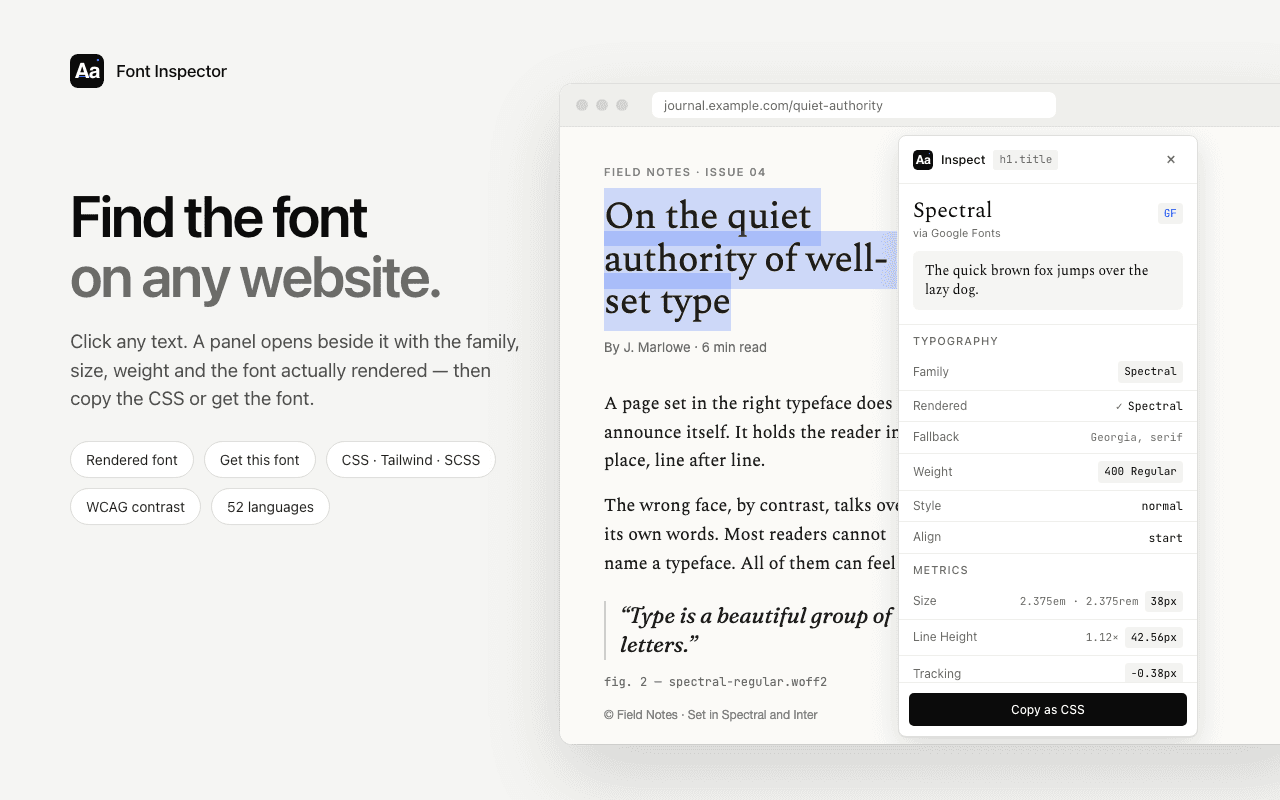
Two things in the panel save you from common mistakes. It shows the font actually rendered and flags a fallback, so you know whether the measurements belong to the typeface you think you are looking at. It also shows the full fallback stack, which you can keep instead of inventing one. Every inspection is saved to a local library in your browser, and the library can be exported as CSS variables or design tokens when you want a whole set at once.
The extension reads live text only. It cannot measure text inside an image, a canvas or a video. For those, see identifying a font from an image.
What is fair to copy, and what is not
Sizes, ratios, weights and spacing are measurements. Nobody owns 18px on a 1.6 line height, and studying how good sites set their type is how most people learn typography. Copy those values freely.
- The font itself needs a license. A
font-familyline only works if you can legally load that font. Google Fonts are open source. Adobe Fonts come with a Creative Cloud subscription. Most other typefaces need a web license from the foundry. Never take font files from another site’s server. Read font licensing explained before you ship. - Do not clone a whole brand. Borrowing a line height is learning. Reproducing a company’s typeface, colors, layout and tone together is imitation, and it can mislead people about who you are.
- Adapt to your own content. Values tuned for one typeface rarely transfer perfectly to another. If you swap the font, revisit the line height and the tracking with your own text on screen.
A good habit: copy the numbers, paste them into your project, and then change at least one thing on purpose. That is when a borrowed style starts to become yours.
Questions & answers
How do I copy the font style from a website?+
Right-click the text, choose Inspect, open the Computed tab and note the font family, size, weight, line height, letter spacing and color. A font inspector extension can copy the same values as ready-made CSS in one click.
How do I convert CSS typography to Tailwind classes?+
Use the matching utility for each property with an arbitrary value in square brackets, for example text-[18px], leading-[1.6], tracking-[-0.01em] and font-medium for weight 500. For values you reuse, define theme tokens so you can write one short class instead.
Why does DevTools show line height in px when the CSS says 1.6?+
The Computed tab shows values after the browser has resolved them to absolute units. Divide the px line height by the px font size to get the unitless ratio back.
Should I use px or rem for font sizes I copy?+
Rem is the safer default because it respects the reader’s browser font size setting. Divide the px value by 16, or by the site’s root font size if it was changed.
Is it legal to copy another website’s CSS typography?+
Measurements such as sizes, weights and spacing are fine to reuse. The font files are licensed software, so you need your own license for the typeface, and you should not copy a brand’s whole visual identity.
Related free tools: PX to REM converter · Type scale calculator
Sources and further reading: Chrome for Developers: CSS features reference ↗ · MDN: line-height ↗ · Tailwind CSS: font-size ↗ · Tailwind CSS: letter-spacing ↗ · Tailwind CSS: theme variables ↗