A typography scale is a short list of font sizes generated by multiplying a base size by a fixed ratio. Start from a 1rem body size, choose a ratio between about 1.125 and 1.333 for most websites, keep five to eight steps, and give every step a role and its own line height.
Why use a scale at all
Open the stylesheet of a site that grew without a plan and you will find 13px, 14px, 15px, 17px and 18px, each added on a different afternoon. Every size made sense on its own. Together they blur the hierarchy, because a reader cannot tell a 17px heading from 16px body text.
A scale replaces those decisions with one. Sizes that share a ratio look related, in the way notes in a musical scale sound related, which is where the ratio names come from. It also gives a team a shared vocabulary: “step 3” instead of “that biggish heading”.
Step 1: begin where people read
The base of the scale is your body text, because that is where readers spend their time. Choose it using real content in the intended layout. Consider the typeface’s proportions: a font with a small x-height looks smaller than another at the same font-size. Consider how far readers are from the screen too.
For most sites the right answer is 1rem. One rem equals the browser’s default font size, which is 16px unless the person has changed it. People who raise that setting did it for a reason. A base value is a design starting point, not a reason to override someone’s reading preferences.
/* Avoid: replaces the reader's preferred size with yours */
html {
  font-size: 16px;
}

/* Better: leave the root alone and build on rem */
body {
  font-size: 1rem;
  line-height: 1.6;
}
If your design file is in pixels, convert with the px to rem converter and keep the rem values in code.
Step 2: choose a ratio and generate the steps
A modular scale multiplies the base size by a ratio for each step up, and divides by it for each step down. Smaller ratios create subtle differences. Larger ratios create a more dramatic hierarchy.
| Ratio | Name | Step 4 from 16px | Good for |
|---|---|---|---|
| 1.067 | Minor second | 20.74px | Very dense interfaces where sizes barely differ |
| 1.125 | Major second | 25.63px | Apps, dashboards, data-heavy screens |
| 1.2 | Minor third | 33.18px | Product interfaces, documentation, mobile layouts |
| 1.25 | Major third | 39.06px | A dependable default for content sites |
| 1.333 | Perfect fourth | 50.52px | Blogs, editorial and marketing pages |
| 1.414 | Augmented fourth | 63.96px | Bold marketing pages with short headlines |
| 1.5 | Perfect fifth | 81px | Landing pages and posters with few sizes |
| 1.618 | Golden ratio | 109.66px | Display work. Too steep for most interfaces |
Here is the full calculation for a 16px base with a 1.25 ratio. Each size is the base times the ratio raised to the step number.
| Step | Calculation | Pixels | rem |
|---|---|---|---|
| -2 | 16 ÷ 1.25 ÷ 1.25 | 10.24 | 0.64 |
| -1 | 16 ÷ 1.25 | 12.8 | 0.8 |
| 0 | 16 | 16 | 1 |
| 1 | 16 × 1.25 | 20 | 1.25 |
| 2 | 20 × 1.25 | 25 | 1.563 |
| 3 | 25 × 1.25 | 31.25 | 1.953 |
| 4 | 31.25 × 1.25 | 39.06 | 2.441 |
| 5 | 39.06 × 1.25 | 48.83 | 3.052 |
| 6 | 48.83 × 1.25 | 61.04 | 3.815 |
Use the type scale calculator to see these relationships with your own base and ratio before writing CSS. Two practical notes. Step -2 is about 10px, which is too small for most text, so you would simply not use it. And rounding is fine: nobody can see the difference between 1.953rem and 1.95rem.
Step 3: assign roles and line heights
A list of numbers is not a system until each one has a job. Map the steps to roles, and you do not need to use every generated value. Five to eight sizes cover most sites.
| Step | Size | Role | Line height |
|---|---|---|---|
| -1 | 0.8rem | Captions, labels, footnotes | 1.5 |
| 0 | 1rem | Body text | 1.6 |
| 1 | 1.25rem | Lead paragraph, small headings | 1.5 |
| 2 | 1.563rem | Subsection heading | 1.3 |
| 3 | 1.953rem | Section heading | 1.25 |
| 4 | 2.441rem | Page title | 1.15 |
| 5 | 3.052rem | Hero or display | 1.1 |
Notice that line height shrinks as size grows. Review line height alongside font size, because a heading at body line height looks like it is falling apart. The reasoning is in line height and letter spacing.
h2 a smaller or larger style. Name your tokens by step or by role, not by tag.Step 4: refine at narrow widths with clamp()
A scale that feels balanced on desktop can overwhelm a phone. A 61px headline leaves room for only a word or two per line on a small screen. Check long headlines and navigation labels at narrow widths. You have two options: switch to a smaller ratio below a breakpoint, or let the large steps scale smoothly with the viewport.
clamp(min, preferred, max) does the second. The preferred value mixes a rem part and a vw part so the size grows in a straight line between two viewport widths. The formula is:
- slope = (max size - min size) ÷ (max viewport - min viewport)
- intercept = min size - slope × min viewport
- preferred value = intercept, converted to rem, plus slope × 100, written in vw
Worked example: a page title that should be 32px (2rem) on a 320px screen and 56px (3.5rem) at 1280px. The slope is (56 - 32) ÷ (1280 - 320) = 0.025, which is 2.5vw. The intercept is 32 - 0.025 × 320 = 24px, which is 1.5rem.
h1 {
  /* 2rem at 320px wide, 3.5rem at 1280px wide, linear in between */
  font-size: clamp(2rem, 1.5rem + 2.5vw, 3.5rem);
  line-height: 1.1;
}- Always include a rem part in the preferred value. A size in
vwalone ignores the reader’s font size setting and barely responds to zoom. - Keep body text fixed or nearly fixed. Fluid sizing is for the top of the scale, where the difference between phone and desktop is large.
- Write the minimum and maximum in rem as well, so the whole expression follows the user’s settings.
Step 5: turn the scale into tokens
Translate the final choices into reusable tokens so arbitrary values stop appearing in your stylesheets. In plain CSS, custom properties are enough.
:root {
  --step--1: 0.8rem;
  --step-0: 1rem;
  --step-1: 1.25rem;
  --step-2: 1.563rem;
  --step-3: 1.953rem;
  --step-4: clamp(2rem, 1.7rem + 1.5vw, 2.441rem);
  --step-5: clamp(2.25rem, 1.85rem + 2vw, 3.052rem);
}

body {
  font-size: var(--step-0);
  line-height: 1.6;
}

h1 {
  font-size: var(--step-5);
  line-height: 1.1;
}

h2 {
  font-size: var(--step-3);
  line-height: 1.25;
}

small,
figcaption {
  font-size: var(--step--1);
  line-height: 1.5;
}
In Tailwind CSS version 4, the same scale goes into the theme as --text-* variables. A companion variable sets the default line height for each size, so text-3xl brings the right leading with it.
@import "tailwindcss";

@theme {
  --text-sm: 0.8rem;
  --text-sm--line-height: 1.5;
  --text-base: 1rem;
  --text-base--line-height: 1.6;
  --text-lg: 1.25rem;
  --text-lg--line-height: 1.5;
  --text-xl: 1.563rem;
  --text-xl--line-height: 1.3;
  --text-2xl: 1.953rem;
  --text-2xl--line-height: 1.25;
  --text-3xl: 2.441rem;
  --text-3xl--line-height: 1.15;
  --text-4xl: 3.052rem;
  --text-4xl--line-height: 1.1;
}theme.extend.fontSize in tailwind.config.js.Sizes are one half of the system. The other half is the typefaces they are applied to, which we cover in how to pair fonts.
Reverse-engineer the scale of a site you like
A good way to choose a ratio is to find out what a site you admire uses. You can work it out by hand.
- Right-click the body text, choose Inspect, open the Computed tab and note
font-size. - Repeat for each heading level, the lead paragraph, captions and buttons.
- Sort the sizes and divide each one by the size below it. If the results cluster around one number, such as 1.2 or 1.25, that is the ratio.
- Resize the window and check again. If the heading size changes smoothly, the site uses fluid type. If it jumps, it uses breakpoints.
Expect some noise. Many production scales are rounded to whole pixels or adjusted by hand, and some are not modular at all. A detailed walkthrough is in how to find font size and line height.
See every size a page uses in one list.
Fonts on this page lists each family with the weights and sizes it appears in, so you can read a site’s type scale without inspecting elements one by one.
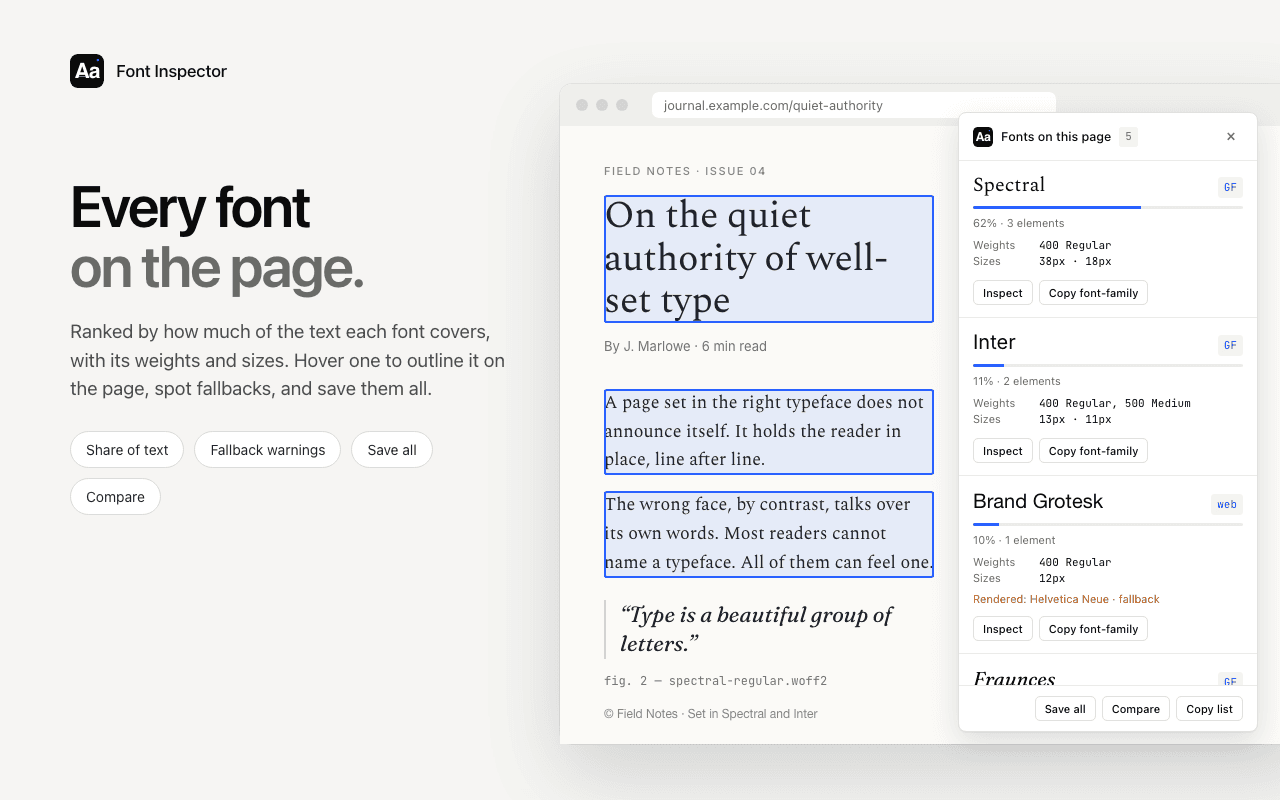
With Font Inspector, open Fonts on this page. Each family is listed with the weights and sizes it is used at, and you can copy the list. Sort the sizes, divide neighbors, and you have the ratio. A long, irregular list is useful information too: it tells you the site has no scale, and shows what that looks like. To capture a single style exactly, click the text and copy it as CSS or Tailwind classes. The panel gives the size in px, em and rem. See how to see all fonts on a page for more on the page-wide view.
Questions & answers
What is a typography scale?+
It is a limited set of font sizes that share a common ratio, used consistently across a design. Each size is the previous one multiplied by the ratio, which makes the sizes look related and the hierarchy clear.
What is the best type scale ratio for a website?+
There is no single best ratio, but 1.2 to 1.333 suits most websites. Use a smaller ratio such as 1.125 or 1.2 for dense interfaces and phones, and a larger one such as 1.333 for editorial and marketing pages.
Should a type scale use px or rem?+
Use rem. One rem follows the browser’s default font size, so people who have increased their text size get a proportionally larger scale. Pixel values on the root element override that preference.
How do I make font sizes responsive with clamp()?+
Use font-size: clamp(min, preferred, max) where the preferred value combines rem and vw, for example clamp(2rem, 1.5rem + 2.5vw, 3.5rem). The rem part keeps the text responsive to user settings and zoom.
How many font sizes should a website have?+
Five to eight sizes cover most sites: one or two below body text, the body size, and four or five heading and display steps. If you need more, check whether weight, color or spacing could do the job.
Related free tools: Type scale calculator · PX to REM converter
Sources and further reading: MDN: clamp() ↗ · MDN: line-height ↗ · Tailwind CSS: font-size ↗ · W3C: Understanding Success Criterion 1.4.4 Resize Text ↗