Right-click the text, choose Inspect, open the Computed tab and read font-size, font-weight, line-height and letter-spacing. The values are in pixels, so divide the line height by the font size to get the ratio, and divide the font size by 16 to get rem on most sites. Font Inspector shows the same values in px, em and rem, with the ratio worked out, when you click the text.
Reading the values in DevTools
These steps are for Chrome, Edge, Brave and other Chromium browsers. Firefox and Safari have an equivalent computed styles view in their inspectors, and the same property names apply.
- Right-click the text and choose Inspect. The Elements panel opens with that element selected. Check that the highlighted element is the text itself and not a wrapper around it.
- In the side pane, switch from Styles to the Computed tab.
- Type
fontinto the filter box at the top of the tab. That narrows the list to the font properties, includingfont-family,font-sizeandfont-weight. - Clear the filter and search for
line-height, thenletter-spacing. - To see the authored value, go back to the Styles tab and find the declaration that is not struck through. Struck-through declarations were overridden by a more specific rule.
- `font-size` is always shown in pixels, often with decimals such as
17.6px. Decimals are a sign that the authored value was relative. - `font-weight` is always a number.
normalbecomes400andboldbecomes700. - `line-height` is shown in pixels, or as the keyword
normalwhen the site never set it.normallets the font decide, and for many fonts it lands around 1.2. - `letter-spacing` is shown in pixels, or
normalwhen no tracking was applied.
span inside a heading can have its own size or weight. If a number looks wrong, check which element is selected. For the family itself, see finding a font with Chrome DevTools.From pixels to rem, em and a line-height ratio
Pixels to rem
rem is relative to the font size of the root html element. Browsers default to 16px, so on most sites the sum is simple: divide the pixel value by 16. 18px is 1.125rem, 24px is 1.5rem, 40px is 2.5rem. If the site changes the root size, divide by that instead. You can check by selecting the html element and reading its computed font-size. The px to rem converter does the sum for any base.
Pixels to em
em is relative to the parent element’s font size, so the same pixel value can be a different em value in different places. Divide the element’s size by its parent’s computed size. Because em values multiply through nested elements, most design systems set font sizes in rem and keep em for things that should follow the text, such as letter spacing and padding.
The line-height ratio
A pixel line height means little on its own. 28px is generous for 16px text and cramped for 24px text. The useful number is the ratio: line height in pixels divided by font size in pixels.
/* Computed: font-size 18px, line-height 28.8px */
/* 28.8 / 18 = 1.6 */

p {
  font-size: 1.125rem; /* 18 / 16 */
  line-height: 1.6;    /* unitless, scales with the text */
}Write the ratio without a unit in your own CSS. A unitless line height is recalculated for every element that inherits it, so it keeps its proportion when the font size changes. A pixel or em line height is inherited as a fixed length, and that is how you end up with large headings whose lines overlap.
What the weight numbers mean
CSS describes weight on a numeric scale. The hundreds have conventional names, and these are the names you will see in font menus and in design tools.
| Value | Common name |
|---|---|
| 100 | Thin (Hairline) |
| 200 | Extra Light (Ultra Light) |
| 300 | Light |
| 400 | Normal (Regular) |
| 500 | Medium |
| 600 | Semi Bold (Demi Bold) |
| 700 | Bold |
| 800 | Extra Bold (Ultra Bold) |
| 900 | Black (Heavy) |
Two things to keep in mind. First, the number is a request. If the family has no file for that weight, the browser picks the nearest one it has, or fakes a bold. A computed 600 does not prove that a true semibold is on screen. Second, font-weight accepts any number from 1 to 1000, and variable fonts can render every step in between. A value such as 450 or 520 is not a mistake. It is a designer tuning the weight by eye, which variable fonts make possible.
Letter spacing: pixels on screen, em in the CSS
The Computed view reports letter spacing in pixels, for example -0.8px. That number only makes sense next to the font size it was applied to. Divide it by the font size to get the em value: -0.8 divided by 40 is -0.02em.
Convert before you reuse it. Spacing set in em scales with the text, so a headline keeps the same optical tightness at every size. Spacing set in pixels is fixed: the -0.8px that looks right at 40px will crush the same text at 16px. As a rule, large headlines are tightened a little and small uppercase labels are opened up. The reasoning is in line height and letter spacing.
Sizes change with the viewport, so measure at the width you care about
A computed value is a snapshot. Many sites change their type across breakpoints with media queries, or scale it continuously with clamp() and viewport units. The headline that is 56px on your wide monitor may be 32px on a phone, often with a different line height and tracking too.
- Resize the window, or use the device mode in DevTools to set an exact viewport width, and read the Computed tab again. The values update live.
- Check at least a phone width and a desktop width. If the size differs at every width you try, it is fluid. If it jumps at certain widths, it is set by breakpoints.
- Keep browser zoom at 100% while you measure. Zooming changes the viewport width in CSS pixels, which can trigger a different breakpoint.
- Look at the authored value in the Styles tab. A
clamp()expression gives you the minimum, the maximum and the rate of change in one line.
If you are rebuilding a scale rather than a single style, collect the sizes of the body text and each heading level at one width, then compare the steps between them. The type scale calculator helps you find the ratio, and building a typography scale explains how to turn it into a system.
The quick way: click the text
All of the above is a few minutes of clicking and dividing per element. Font Inspector does the same reading and the same arithmetic in one step. Click the toolbar icon and choose Pick text on page, or press Alt + Shift + F (Option + Shift + F on Mac), then click the text. If you grabbed a wrapper, ↑ and ↓ move to the parent or child element.
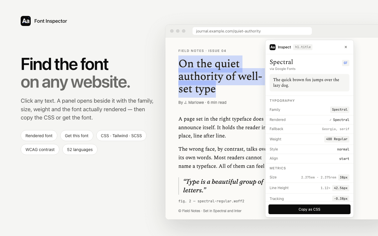
- Size in px, em and rem at once, so there is no conversion to do.
- Line height in px and as a ratio.
- Weight as a number and a name, plus the style.
- Letter spacing, and the variable font axes when the page uses them.
- Click any value to copy it, or copy the whole style as CSS, Tailwind classes or SCSS variables. See copying typography as CSS or Tailwind.
The same rule applies as in DevTools: the numbers describe the text at the current viewport width. Resize the window and inspect again to see the other end of a responsive range.
Size in px, em and rem, with the line-height ratio done for you.
Click any text and Font Inspector shows its size, weight, line height and letter spacing in one panel. Click a value to copy it. Free, no account.
A sanity check: typical ranges for body and heading text
Once you have the numbers, it helps to know whether they are ordinary or unusual. The table below is general guidance based on common practice, not measurements from any set of sites. Good typography regularly steps outside these ranges on purpose, and the right values always depend on the typeface and the line length.
| Role | Size | Weight | Line-height ratio | Letter spacing |
|---|---|---|---|---|
| Body text | 16 to 20px | 400 | 1.5 to 1.7 | normal |
| Small print and captions | 12 to 14px | 400 to 500 | 1.4 to 1.5 | normal to 0.01em |
| Subheadings | 20 to 32px | 600 to 700 | 1.2 to 1.35 | normal to -0.01em |
| Large headings | 36px and up | 600 to 800 | 1.0 to 1.2 | -0.01em to -0.03em |
| Uppercase labels | 11 to 13px | 500 to 700 | 1.2 to 1.4 | 0.05em to 0.1em |
| Buttons and interface text | 14 to 16px | 500 to 600 | 1.0 to 1.3 | normal |
The pattern matters more than the figures. As text gets larger, line height and letter spacing get tighter. As it gets smaller, both open up. MDN recommends a line height of at least 1.5 for main paragraph content, because it helps readers with low vision and with cognitive conditions such as dyslexia. If the body text you measured sits well under that, it is worth questioning before you copy it.
Questions & answers
How do I check the font size on a website?+
Right-click the text, choose Inspect, open the Computed tab and find font-size. The value is in pixels at the current window width. A font inspector extension shows the same value when you click the text.
Why does DevTools show px when the CSS uses rem?+
The Computed tab shows values after the browser has resolved them. Relative units such as rem, em, percentages and clamp() are all converted to pixels for the current element and viewport. The authored value is in the Styles tab.
How do I work out the line-height ratio?+
Divide the computed line height in pixels by the computed font size in pixels. A 28.8px line height on 18px text is a ratio of 1.6.
What font weight number is bold?+
Bold is 700 and normal is 400. The scale runs from 100 (Thin) to 900 (Black), and variable fonts can use values in between, such as 450.
How do I convert px to rem?+
Divide the pixel value by the root font size, which is 16px unless the site changes it. 24px divided by 16 is 1.5rem.
Related free tools: PX to REM converter · Type scale calculator
Sources and further reading: MDN: font-size ↗ · MDN: font-weight ↗ · MDN: line-height ↗ · MDN: letter-spacing ↗ · MDN: clamp() ↗ · Chrome for Developers: CSS features reference ↗