font-family is a preference list, not a guarantee. The browser draws each character with the first font in the list that is available and contains that character, so a failed download, a name mismatch or a missing weight quietly puts a fallback on screen. Compare the declared stack with the Rendered Fonts section in DevTools to see what really happened.
Declared font vs rendered font
You set a heading in a carefully chosen typeface, open the page on another machine, and it shows up in Arial or Times New Roman. Nothing in your CSS changed. What changed is which fonts the browser could actually get hold of.
There are two different answers to “what font is this?”. The declared font is what the stylesheet asks for. The rendered font is what the browser ended up drawing. A name in the stylesheet does not prove that the font file loaded successfully. When a design looks wrong, the second one is the one that matters.
h1 {
  font-family: "Brand Sans", "Helvetica Neue", Arial, sans-serif;
}How the browser walks the stack
The browser considers the font-family list in order, and it does so for every character, not once per element. For each character it runs roughly this routine:
- Take the first family name. Is it available, either installed on the device or defined by an
@font-facerule? - If it is a web font with a
unicode-range, is this character inside the range? If not, the file is not even downloaded for it. - Within the family, pick the face closest to the requested weight, style and width.
- Does that face contain a glyph for this character? If yes, draw it. If no, move to the next family and repeat.
- If the whole list is exhausted, use a system fallback font that has the glyph.
This is why one line can contain several fonts. The preferred family might cover Latin text but lack an arrow, an emoji or a character from another writing system, so a later family supplies that glyph. A single computed font-family value never fully describes every letter on the page.
Always end with a generic family
Generic families are keywords, not font names. They tell the browser what kind of font to use when nothing else in the list works. Write them without quotes. A quoted generic is treated as the name of a font, and no font has that name.
| Keyword | What you get |
|---|---|
serif | The default serif on the device, such as Times New Roman or a Noto serif |
sans-serif | The default sans, such as Arial, Helvetica or Roboto |
monospace | A fixed-width font for code |
system-ui | The interface font of the operating system |
ui-serif, ui-sans-serif, ui-monospace, ui-rounded | Interface variants. Support varies by browser, so follow them with a classic generic |
How web fonts load, and what font-display does
An @font-face rule only registers a family name and says where its file lives. The browser downloads the file later, when it finds text on the page that needs that exact family, weight and style. Until the file arrives, the text needs something to be drawn with. The font-display descriptor decides what.
@font-face {
  font-family: "Brand Sans";
  src: url("/fonts/brand-sans-400.woff2") format("woff2");
  font-weight: 400;
  font-style: normal;
  font-display: swap;
}
The loading timeline has two phases. In the block period the text is invisible while the browser waits. In the swap period the fallback is visible, and it is replaced if the web font arrives. After that the browser gives up and keeps the fallback for this page view.
| Value | Block period | Swap period | Use it when |
|---|---|---|---|
auto | Browser decides | Browser decides | You have no preference |
block | Short, around 3 seconds | Unlimited | The font is essential, such as an icon font |
swap | Extremely small | Unlimited | Text must be readable at once and the brand font should always appear |
fallback | Extremely small, around 100ms | Short, around 3 seconds | You want the web font, but not a late swap in the middle of reading |
optional | Extremely small | None | Stability matters most. On a slow connection the visitor keeps the fallback |
font-display: swap fixes invisible text, but it guarantees a visible change when the font arrives. If the fallback has different proportions, lines rewrap and the layout jumps. That is a reason to tune the fallback, which we cover below.Why the declared font is not showing: common causes
A missing file, a blocked request or a small naming slip can make an intentional design look wrong. These are the causes worth checking first.
| Cause | What you see | Fix |
|---|---|---|
| Wrong path | The font request returns 404 | Paths inside url() resolve relative to the stylesheet, not the HTML page. Use a root-relative or absolute URL |
| Cross-origin request without CORS | The file is requested, then rejected, with a CORS error in the console | Fonts are always fetched in CORS mode. The font server must send an Access-Control-Allow-Origin header, and a preload link for a font needs the crossorigin attribute |
| Format or MIME type | The file downloads but the font never applies | Serve WOFF2, and make sure the format() hint matches the real file |
| Family name mismatch | No font request at all | The name in font-family must match the @font-face name. Inter Var and Inter are different families |
| Weight or style not provided | Bold looks smeared, italic looks mechanically slanted | The browser synthesizes a fake bold or italic from the regular file. Add the real weight, or use a variable font with a weight range |
| Character outside the subset | Most text is right, some letters or symbols are not | The file, or its unicode-range, does not cover those characters. Load a wider subset |
| Blocked on the visitor’s side | Works for you, not for them | Content blockers, privacy settings, data saver modes and company networks can block font downloads. Only a good fallback helps here |
To make synthesized styles obvious while you debug, switch them off. Text that relied on a fake bold drops back to regular weight.
body {
  font-synthesis: none;
}
How to debug a fallback in DevTools
Check the failure before changing the design. In Chrome, Edge and other Chromium browsers the whole investigation takes a few minutes.
- Right-click the text that looks wrong and choose Inspect.
- In the Elements panel, open the Computed tab and find
font-family. That is the declared stack after the cascade has been resolved. - Scroll to the bottom of the Computed tab to Rendered Fonts. It names the font actually used, says whether it is a network resource or a local file, and counts the glyphs drawn with it. Two fonts listed for one element means a per-character fallback.
- Open the Network panel, filter by Font and reload. Every row is a font file the page requested. Look for a missing row, a 404 or a failed request.
- Open the Console and look for CORS messages that mention a font URL.
- Throttle the connection in the Network panel and reload to watch the block and swap periods happen slowly.
In Firefox, the Fonts tab of the Inspector shows the fonts used by the selected element, which gives you the same declared versus rendered comparison. The step-by-step version with every panel is in how to find a font with Chrome DevTools, and other browsers are covered in Firefox, Safari and Edge.
See the rendered font without opening DevTools.
Font Inspector shows the declared stack and the font actually rendered side by side, and flags the element when a fallback is being drawn. Click any text to check it.
The faster check
With Font Inspector, click the text and read two lines in the panel: the family with its full fallback stack, and the rendered font. When they differ, the panel shows a fallback flag. It also tells you the source of each family: Google Fonts, Adobe Fonts, a self-hosted web font or a system font installed on the device. That last label explains many “works on my machine” cases. If the source is a system font, the page looks right for you only because you happen to have the font installed.
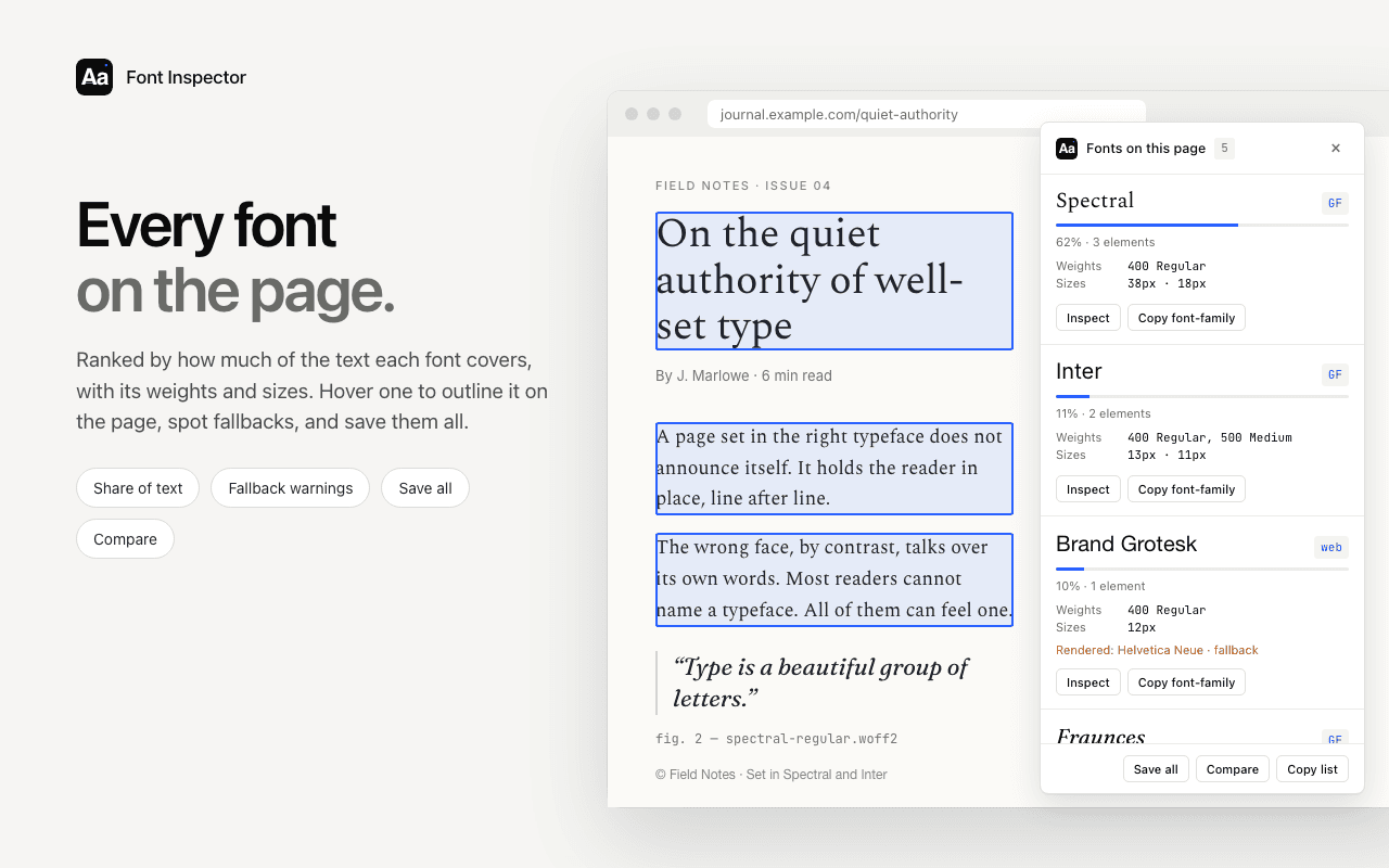
To audit a whole page rather than one element, open Fonts on this page. It lists every family ranked by share of text, with fallback warnings. See how to see all fonts on a page. One honest limit: rendered-font detection is reliable for the primary family of an element. A single line can still mix fonts character by character, and for that level of detail the glyph counts in Rendered Fonts are the better tool.
Design the fallback deliberately
Some visitors will always see your fallback, at least for a moment. Try the page with the web font disabled and notice what changes: heading wraps, button widths, paragraph height. Choose a fallback with similar proportions, and leave room for content to grow.
You can go further and reshape the fallback so it occupies the same space as the web font. Four @font-face descriptors do this. size-adjust scales the glyphs so the average character width matches. ascent-override, descent-override and line-gap-override replace the vertical metrics so every line ends up the same height.
@font-face {
  font-family: "Brand Sans";
  src: url("/fonts/brand-sans-400.woff2") format("woff2");
  font-weight: 400;
  font-display: swap;
}

/* A local font, reshaped to take up the same space as Brand Sans */
@font-face {
  font-family: "Brand Sans Fallback";
  src: local("Arial");
  size-adjust: 105%;
  ascent-override: 92%;
  descent-override: 24%;
  line-gap-override: 0%;
}

body {
  font-family: "Brand Sans", "Brand Sans Fallback", sans-serif;
}- The values come from the two fonts’ metrics: average character width, ascent, descent, line gap and units per em. The Chrome team’s article in the sources gives the formulas.
- Frameworks can generate the block for you. Next.js does it automatically when you load fonts through
next/font. size-adjustworks in all current major browsers. The three override descriptors are not supported everywhere yet, so treat them as a progressive improvement. A browser that ignores them still shows a working fallback.
Matching the width matters most, because width decides where lines break. Once the fallback wraps like the real font, the swap is barely noticeable and the layout stops shifting. Line height plays a part too, which we cover in line height and letter spacing.
When the fallback is the design: system font stacks
Sometimes the best web font is none. A system font stack downloads nothing, renders at once and feels native on every platform. It is a common choice for apps, dashboards and documentation.
body {
  font-family: system-ui, -apple-system, "Segoe UI", Roboto, "Helvetica Neue",
    "Noto Sans", "Liberation Sans", Arial, sans-serif;
}

code,
pre {
  font-family: ui-monospace, SFMono-Regular, Menlo, Consolas,
    "Liberation Mono", monospace;
}
The trade-off is control. The page will look different on every operating system, by design. If you inspect such a site, the rendered font is whatever your own device supplies. If you want to reuse a stack you found, copy the typography as CSS or Tailwind instead of retyping it.
Questions & answers
Why does my font look different on another computer?+
The declared font is probably not loading there, or it was never a web font and is only installed on your machine. The browser then draws the next available font in the font-family list. Check the rendered font in DevTools on the affected device.
Why is my @font-face font not loading?+
The usual causes are a wrong file path, a cross-origin request without CORS headers, a family name that does not match the @font-face rule, or a weight that was never declared. The Network panel filtered to Font shows whether the file was requested and what came back.
What is a fallback font in CSS?+
It is any font listed after the first one in font-family. The browser uses it when the preferred font is unavailable or lacks a character. The list should end with a generic family such as serif or sans-serif.
Which font-display value should I use?+
swap suits most content sites because text is readable immediately and the web font always appears. Use optional when layout stability matters more than the brand font, and block only for fonts the page cannot work without.
How do I stop layout shift when a web font loads?+
Define an adjusted fallback with size-adjust and the metric override descriptors so the fallback takes up the same space as the web font. Delivering the font file early also shortens the time the fallback is visible.
Related free tools: PX to REM converter
Sources and further reading: MDN: font-family ↗ · MDN: font-display ↗ · MDN: size-adjust ↗ · MDN: ascent-override ↗ · Chrome for Developers: Improved font fallbacks ↗ · web.dev: Best practices for fonts ↗