WCAG 2 asks for a contrast ratio of at least 4.5:1 for normal text and 3:1 for large text at level AA. In Chrome, inspect the text, click the color swatch next to color in the Styles tab, and read the Contrast ratio line in the color picker. Font Inspector shows the text color, the background color and a WCAG check for the exact text you click.
The numbers to aim for
Gray text on a white page can look refined on a designer’s monitor and vanish on a phone in daylight. Contrast checks exist so you do not have to guess. The Web Content Accessibility Guidelines (WCAG) 2 define a contrast ratio between text and its background, and set minimums for two conformance levels.
| Text | Level AA | Level AAA |
|---|---|---|
| Normal text | 4.5:1 | 7:1 |
| Large text: 24px and up, or about 18.66px and up when bold | 3:1 | 4.5:1 |
AA is the level most laws, policies and design systems refer to, so 4.5:1 for body copy is the number to remember. The thresholds are hard limits. WCAG’s own guidance notes that 4.499:1 does not meet 4.5:1, so do not round up.
A few things are exempt: text in a logo or brand name, text in disabled controls, and text that is pure decoration. Everything a person is supposed to read should pass, and that includes placeholder text, captions and footer links.
How the ratio is computed
Each color is first converted to a relative luminance, a number from 0 for black to 1 for white. The red, green and blue channels are linearized and then weighted, with green counting the most and blue the least, because that is roughly how our eyes respond to them. The ratio is the lighter luminance plus 0.05, divided by the darker luminance plus 0.05. Identical colors give 1:1. Black on white gives 21:1, the maximum. The order does not matter, so dark on light and light on dark score the same. The formula knows nothing about font, weight or size. That is why the large text rule exists as a separate threshold, and why some pitfalls below need your eyes as well as the math.
L = 0.2126 * R + 0.7152 * G + 0.0722 * B   (linearized sRGB channels)

contrast ratio = (L_lighter + 0.05) / (L_darker + 0.05)One reference point is worth memorizing: on a pure white background, #767676 is the lightest gray that still passes AA for normal text, at about 4.54:1. Anything lighter fails.
Check contrast in Chrome DevTools
Chrome, Edge and other Chromium browsers have a contrast checker built into the color picker. It works on the real page, with the real colors, and needs nothing installed.
- Right-click the text and choose Inspect.
- In the Styles tab, find the
colordeclaration that applies to the text. If it is inherited, scroll down to the rule it is inherited from. - Click the small color swatch next to the value. The color picker opens.
- Read the Contrast ratio line. Expand it to see the AA and AAA thresholds, each marked as passed or failed. Lines drawn across the color field show where the thresholds fall, so you can drag the color to the passing side and watch the ratio change.
There is a quicker spot check too. Turn on the element picker in the top left corner of DevTools and hover any text. The tooltip that follows the cursor includes an accessibility section with the contrast ratio and a pass or fail mark.
Find every problem on the page
- CSS Overview. Open it from the DevTools menu under More tools, then capture an overview. Its Colors section lists the text with low contrast, and each entry links to the elements that use it.
- Lighthouse. Run an accessibility audit in the Lighthouse panel. Text with insufficient contrast is reported as a failed audit with the affected elements listed.
Check the text you are actually looking at.
Click any live text and Font Inspector shows its color, its background color and a WCAG contrast check, next to the font, size and weight. Free, no account.
Check contrast in Firefox
Firefox puts its checker in the Accessibility panel of the developer tools. Open the panel, find the Check for issues menu and choose Contrast. The accessibility tree is filtered down to the text nodes that fail, and selecting one highlights it on the page.
Firefox also handles a case Chrome skips. When text sits on a gradient or a background image, the Accessibility Inspector reports a range of contrast values, from the worst spot behind the text to the best. Judge by the low end of that range, since that is where someone will struggle to read.
This guide sticks to Chrome and Firefox because their contrast tools are the most direct. If you normally work in another browser, it is worth opening the page in one of these two for the check. Our guide to finding fonts in Firefox, Safari and Edge covers how the inspectors differ.
Pitfalls the numbers miss
A passing ratio on one element in one state is not the whole story. These are the places where live sites fail most often.
- Text over images and gradients. The background changes from letter to letter. Check the lightest and darkest areas behind the text. A semi-transparent overlay between the image and the text is the usual fix.
- Transparency. A text color with alpha, or an
opacityon a parent element, blends with whatever is behind it. The color that matters is the blended result, not the value written in the CSS. - Hover, focus and visited states. Links often get lighter on hover. In Chrome, the :hov toggle in the Styles tab forces a state so you can inspect it without holding the mouse still.
- Disabled controls. WCAG exempts them, but people still need to read what a disabled button says to understand the form. Aim for legible even if you do not aim for 4.5:1.
- Dark mode. It is a second color scheme, and it needs its own check. DevTools can emulate
prefers-color-schemefrom the Rendering tab, so you can test both without changing your system setting. Light text on dark can also pass the math and still glow uncomfortably, so look at it. - Thin font weights. The formula ignores stroke thickness. Light and thin weights are drawn with fewer and fainter pixels, so they read lighter than their declared color. If body text is set at weight 300, treat 4.5:1 as the floor and aim higher.
- Small sizes. The large text allowance starts at 24px. It is not a license to use 3:1 on a 20px subheading.
Size, weight and line height all change how readable a given contrast feels. If you are tuning them together, line height and letter spacing is a useful companion, and how to find font size and line height shows where to read the current values.
Color formats, and why OKLCH helps when you fix contrast
The same color can be written several ways. They are interchangeable for the browser, but not equally pleasant to edit.
| Format | Example | Good for |
|---|---|---|
| HEX | #57606a | Pasting into design tools and contrast checkers |
| RGB | rgb(87 96 106) | What DevTools reports as the computed value |
| HSL | hsl(212 10% 38%) | Quick edits by hue, though its lightness is not perceptual |
| OKLCH | oklch(0.48 0.02 250) | Adjusting lightness predictably while keeping the hue |
When a color fails, the fix is nearly always to make the text darker or lighter while keeping its character. HSL is poor at this. Its lightness value is a geometric midpoint, so a yellow and a blue with the same HSL lightness look nothing alike in brightness. In oklch(), the first value is perceived lightness, from 0 for black to 1 for white. The second is chroma, or how colorful it is, and the third is the hue angle.
/* Too light on white: lower L and leave chroma and hue alone */
.caption {
  color: oklch(0.62 0.02 250);
}

.caption {
  color: oklch(0.48 0.02 250); /* same hue, clearly darker */
}One caution: OKLCH lightness is not the same quantity as WCAG relative luminance. It gets you to a passing color in fewer tries, but you still need to run the check on the result. All current major browsers support oklch() in CSS.
The faster route: click the text with Font Inspector
The DevTools route works, but it is several clicks per element, and you have to hunt for the rule that sets the color. When you are reviewing a whole page of headings, captions, links and buttons, that adds up. Font Inspector puts the check in the same panel as the rest of the typography.
- Click the toolbar icon and choose Pick text on page, or press
Alt + Shift + F(Option + Shift + Fon Mac). You can also right-click any text and choose Inspect Font. - Hover the text and click it. Use
↑and↓to move to the parent or child element if needed. - In the panel, read the text color and the background color, shown in HEX, RGB, HSL or OKLCH, together with the WCAG contrast check for that exact text.
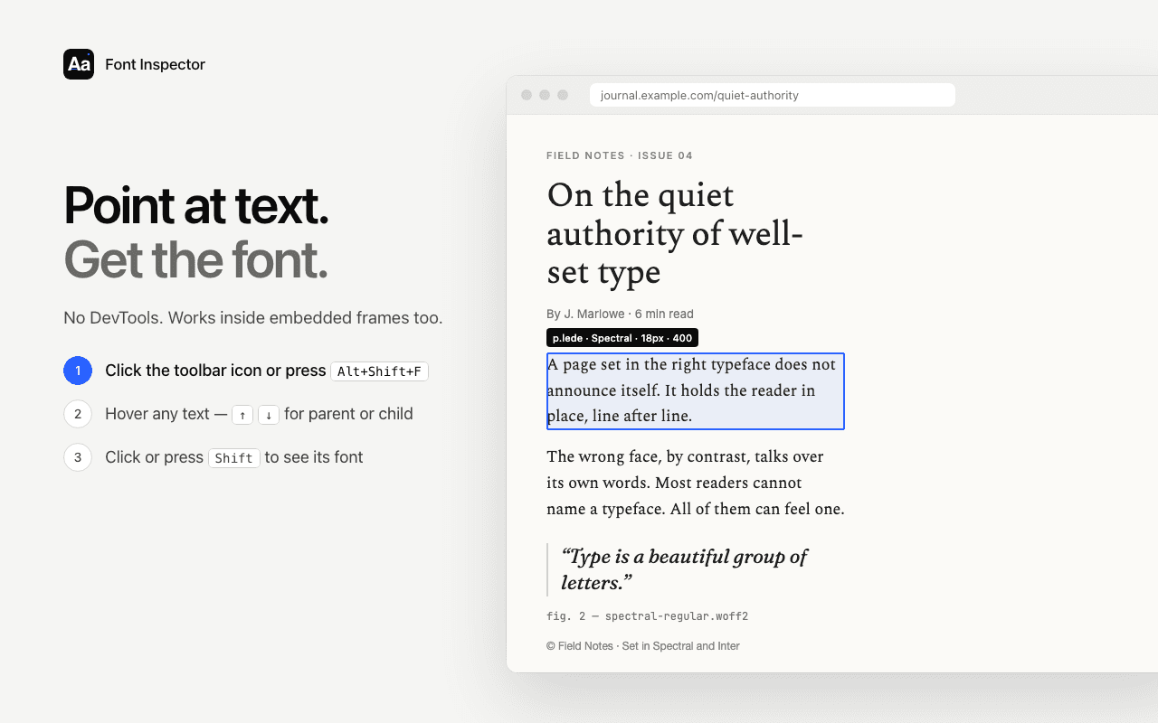
Having everything in one place matters here, because contrast depends on more than two colors. The panel shows the size and the weight, so you can tell at once whether the text counts as large. Click a color value to copy it. With the color shown as OKLCH, you have a starting point for the fix: lower or raise the lightness and check again. When the style is right, you can copy it as CSS, Tailwind or SCSS.
The limits are the same as for any tool that reads the page’s code. It works on live text, not on text inside images, canvas or video. For text over a photo or a gradient, no single background color describes what is behind the letters, so treat the number as a hint and check the hardest spot by eye.
Questions & answers
What contrast ratio does text need to pass WCAG?+
At level AA, normal text needs at least 4.5:1 and large text needs at least 3:1. Level AAA raises those to 7:1 and 4.5:1. Large text means 24px and up, or about 18.66px and up when bold.
How do I check color contrast in Chrome?+
Right-click the text, choose Inspect, and click the color swatch next to the color property in the Styles tab. The color picker shows the contrast ratio and whether it meets AA and AAA.
How do I find all low contrast text on a page?+
In Chrome DevTools, capture a CSS Overview and look at the contrast issues in its Colors section, or run a Lighthouse accessibility audit. In Firefox, open the Accessibility panel and choose Contrast under Check for issues.
Is APCA part of WCAG?+
No. APCA is a newer proposed contrast method and is not part of WCAG 2. For compliance with WCAG 2, use the 4.5:1 and 3:1 ratios.
Why does my text pass the contrast check but still look hard to read?+
The WCAG formula compares two colors and ignores font weight, size and rendering. Thin weights, small sizes and text over busy backgrounds can read lighter than the number suggests, so aim above the minimum.
Related free tools: Type scale calculator
Sources and further reading: W3C: Understanding Success Criterion 1.4.3 Contrast (Minimum) ↗ · W3C: Understanding Success Criterion 1.4.6 Contrast (Enhanced) ↗ · Chrome for Developers: Make your website more readable ↗ · Chrome for Developers: CSS Overview ↗ · Firefox DevTools: Accessibility Inspector ↗ · MDN: oklch() ↗