A font swipe file is a running collection of type you have seen working on real sites, saved with enough detail to reuse: family, weight, size, line height, where you saw it and what it was used for. Record finds at the moment you notice them, group them by project or mood, compare shortlists with the same sample text, export a backup, and check the license before you commit.
Why designers keep a type swipe file
You start a new project, you need a typeface, and your mind goes blank. You know you saw the right thing a few weeks ago. A serif on a magazine site, confident but not stuffy. You cannot remember the site, and you never knew the name.
A swipe file fixes that. The term comes from copywriting, where writers kept folders of ads worth studying. For type, it is a personal record of fonts you have seen doing a real job on a real page. That is different from browsing a font catalog, and more useful, for three reasons.
- You saw it in context. A specimen page shows a font at its best. A live site shows it at 16px in a long paragraph, next to buttons and form labels, which is where your project will use it too.
- It reflects your taste. After a few months the file shows patterns: you keep saving humanist sans serifs, or tight grotesque headlines. That is a style direction you can name to a client.
- It shortens the blank-page phase. Starting from twelve fonts you already like beats starting from a catalog of thousands.
The catch is that a swipe file only works when saving costs almost nothing. If every find needs a screenshot, a DevTools session and a row in a spreadsheet, you will stop after a week.
What to record for each find
A family name alone is a weak note. Two sites can use the same typeface and feel nothing alike, because the feel comes from the settings. Record the whole recipe.
| Record | Why it matters | Example |
|---|---|---|
| Family | The name you will search for and license | Source Serif 4 |
| Weight | 400 and 500 read very differently across a page | 400 body, 600 headings |
| Size | Tells you the scale the design was built for | 18px body, 48px h1 |
| Line height | Most of the texture of a paragraph | 1.6 body, 1.1 headings |
| Letter spacing | Large headlines are often tightened, small labels opened | -0.02em on h1 |
| Where seen | So you can go back and look again | The site and page |
| Role | Headline, body, UI label, caption, pull quote | Long-form body text |
| Source | Hints at the license: Google Fonts, Adobe Fonts, self-hosted, system | Google Fonts |
The role is the field people skip and later miss. A font that was lovely as a 72px headline may be tiring as body copy. Note what you saw it do.
The manual way
You can collect all of this with browser DevTools and any note-taking tool.
- Right-click the text and choose Inspect, then open the Computed tab.
- Read
font-family,font-weight,font-size,line-heightandletter-spacing. In Chrome and Edge, scroll to Rendered Fonts at the bottom to confirm which font in the stack is really being drawn. - Paste the values into a spreadsheet or a notes document with the page URL, and add a screenshot so you remember what it looked like.
This works, and the screenshot habit is worth keeping whatever tool you use. It takes a couple of minutes per find, which is exactly the friction that makes most swipe files die young. Details on reading each value are in how to find font size and line height.
The low-friction way: let the inspection be the note
Font Inspector saves every inspection to a local library automatically. The act of checking a font is the act of filing it, so there is no second step to forget.
- Press
Alt + Shift + F(Option + Shift + Fon Mac), or click the toolbar icon and choose Pick text on page. Right-click, Inspect Font works too. - Click the text you like. The panel shows the family, the rendered font, source, weight, size in px, em and rem, line height and letter spacing. The inspection is now in your library.
- If the whole page is good, open Fonts on this page and save all families to the library at once.
Inspect the different roles separately: one click on the headline, one on the body text, one on a button or label. That gives you the pairing and the hierarchy, not only a name. The thinking behind why certain pairs work is covered in font pairing basics.
A swipe file that fills itself.
Every font you inspect with Font Inspector is saved to a local library with its weight, size and spacing. Group finds into collections, compare up to four side by side and export the lot. Free, no account.
Organize by project or by mood
An unsorted pile becomes useless at around fifty entries. Two ways of grouping hold up over time, and they work well together.
- By project. One group per client or product: “Clinic rebrand”, “Docs site”. Add candidates during research and delete the group’s losers when the decision is made.
- By mood or job. Groups that outlive any project: “Warm editorial serifs”, “Dense UI sans”, “Friendly rounded”, “Mono for code”. These are the ones you will reach for in a year.
In Font Inspector’s library, collections are the tool for this. You can also filter by sans, serif, mono and display, filter by source, pin favorites, and switch between a view by site and a view by family. The view by site answers “what was that magazine using?”. The view by family answers “where have I seen this font used well?”, which is often the more interesting question.
Compare candidates with the same sample text
Memory is unreliable with type. Two fonts that felt similar on different sites on different days can turn out to have very different widths, x-heights and color on the page. The only fair test is the same words, at the same size, next to each other.
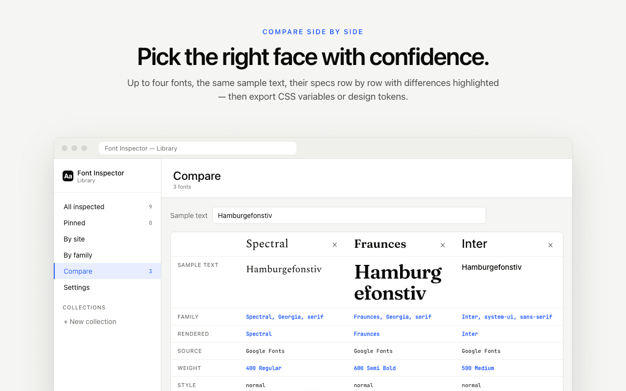
The library’s compare view takes up to four fonts and shows them side by side with the same sample text. Use text from the actual project, not a pangram. Look for these things:
- Width. How many words fit on a line? A wide face can push a headline onto a third line.
- x-height. A font with a tall x-height looks bigger at the same
font-sizeand usually stays readable at smaller sizes. - Texture. Squint. Is the paragraph an even gray, or spotty?
- The awkward characters. Numerals, the ampersand, quotation marks, and any accented letters your content needs.
When you have two finalists, try them in a realistic layout. The font pairing playground lets you set a heading and body font together, and the type scale calculator gives you sizes to test them at.
Export and back up your library
Font Inspector keeps the library locally in your browser. Nothing is synced to a server. That is good for privacy, and it also means the library is not a cloud backup. If you reset the browser profile, remove the extension or move to a new computer, the data does not follow you unless you export it.
- JSON is the backup format. Export it regularly and keep the file wherever you keep other project files. You can import a JSON library back, which is also how you move the library to another machine.
- CSS variables are handy when a shortlist turns into a build and you want the chosen values in a stylesheet.
- Design tokens suit teams that keep decisions in a token file. The route from there is described in from a live website to typography design tokens.
A good habit is to export after any big research session and at the end of each project. The JSON file doubles as a record of what you considered, which is useful when a client asks six months later why you chose one font over another.
From shortlist to decision, with a license check
A swipe file gives you candidates. Turning candidates into a choice is a short, repeatable process.
- Pull three or four candidates from the relevant mood group into a project collection.
- Compare them with real project text. Drop any that fail on width, texture or missing characters.
- Check that each survivor has the weights and styles you need. A family with no italic or no semibold will hurt later. If it is a variable font, note the axes it offers. See variable fonts explained.
- Check the license and the cost for your expected use.
- Test the winner in the real layout at real sizes before you announce it.
Step four is the one that kills favorites, so do it before you fall in love. Finding a font on a website does not license it. The source shown for each find is a first hint: fonts served by Google Fonts are open source and free for commercial work, Adobe Fonts come with a Creative Cloud subscription, and a self-hosted font usually means a license bought from a foundry. Confirm at the foundry or provider every time. Font licensing explained covers the license types.
If a favorite is out of budget, Font Inspector’s Get this font section suggests free Google Fonts look-alikes for popular paid and system fonts. They are similar, not identical, so put the look-alike through the same comparison as everything else. There is more on that in how to get the font you found.
Questions & answers
What is a font swipe file?+
It is a personal collection of typography you have seen working on real websites, saved with details such as family, weight, size and line height. Designers use it as a starting shortlist for new projects.
What should I save besides the font name?+
Save the weight, size, line height, letter spacing, the page where you saw it and the role the font played, such as headline or body text. The settings are what make a font feel the way it does.
Where does Font Inspector store my saved fonts?+
In your browser, on your device. Nothing is synced to a server, so export the library as JSON if you want a backup or need to move it to another computer.
How many fonts can I compare at once?+
The Font Inspector library compares up to four fonts side by side using the same sample text.
Can I use any font I have saved in my swipe file?+
Not automatically. Saving or identifying a font is fine, but using it needs a license from its maker unless it is an open source font. Check the license before you commit to a typeface.
Related free tools: Font pairing playground · Type scale calculator
See it on real sites: What font does Spotify use? · What font does Vercel use? · What font does Figma use? · What font does Canva use?
Sources and further reading: MDN: font-family ↗ · MDN: line-height ↗ · Google Fonts Knowledge: Choosing type ↗