To pair fonts, choose the body typeface first, then add a heading typeface that differs from it in one obvious way, such as serif against sans, while sharing similar proportions. Two families are enough for most sites. Test the pair on a real page with real content, not on a specimen of two large letters.
Give each font a job
Most pairing advice starts with taste. Start with roles instead. A pairing works when each typeface has a clear job and neither tries to do the other’s.
- Body. It does the most sustained work, so choose it first. Test a full paragraph at the size your readers will see. You want even texture, open letterforms, a real italic and at least two weights.
- Headings. This is where tone lives. A heading face can be sharper, heavier, narrower or more decorative than anything you would read for ten minutes.
- Interface and data. Buttons, labels, tables and code. Often this is the body face again. Sometimes it is a monospace.
Two expressive display faces compete even when each looks beautiful on its own. If both fonts are shouting, neither is heard. One voice with character and one quiet workhorse is the arrangement that almost always holds up.
Look for one useful contrast
The rule behind nearly every good pairing: contrast in one dimension, harmony in the others. A difference should look intentional. Two faces that are almost the same look like a mistake, as if the wrong font loaded. Two faces that differ in every way look like two different websites.
| Dimension | What to compare | How to use it |
|---|---|---|
| Structure | Serif against sans, slab against grotesque, humanist against geometric | The easiest contrast to see. A serif heading over a sans body, or the reverse, rarely fails |
| Weight | How heavy the heading is next to the text | Skip a step. 700 over 400 reads as a decision. 500 over 400 reads as an accident |
| Width | Condensed, normal or wide letterforms | A condensed heading saves space on long titles. Keep the body at normal width |
| x-height | The height of lowercase letters relative to capitals | Aim for harmony here. Similar x-heights make two families sit comfortably on the same line |
| Stroke contrast | The difference between thick and thin strokes | High contrast is striking in headings and tiring in small text |
| Mood | Formal, friendly, technical, literary | Let the heading set the mood and keep the body neutral |
A quick test: put the lowercase a, g, e and n of both fonts side by side at the same size. If the round letters have a similar shape and the lowercase heights roughly match, the families share a skeleton and will usually get along, however different their details are.
One family may be enough
If two faces seem almost identical, drop one. A single family with different weights often creates a more coherent result, with fewer files to load. Size, weight, color and space can carry a whole hierarchy.
The next step up is a superfamily: a serif, a sans and sometimes a mono drawn together with shared proportions. The harmony is built in, so you only supply the contrast. These are all open source and available on Google Fonts:
- IBM Plex: IBM Plex Sans, IBM Plex Serif and IBM Plex Mono.
- Source: Source Sans 3, Source Serif 4 and Source Code Pro.
- Roboto: Roboto, Roboto Slab, Roboto Serif and Roboto Mono.
- Noto: Noto Sans and Noto Serif, with coverage for a very wide range of scripts. A strong choice when your site is multilingual.
Safe pairing patterns, with examples
These patterns are dependable starting points. Every family named here is open source and on Google Fonts, so you can try them today and use them commercially.
| Pattern | Heading | Body | Why it works |
|---|---|---|---|
| Display serif over plain sans | Playfair Display | Source Sans 3 | High stroke contrast on top, a calm and open sans underneath. Classic editorial feel |
| Soft serif over neutral sans | Fraunces | Inter | Fraunces brings warmth and personality. Inter stays out of the way and is built for screens |
| Characterful sans over quiet sans | Space Grotesk | IBM Plex Sans | Both are sans, so the contrast comes from the quirky details and weight of the heading. Suits technical products |
| Sibling families | DM Serif Display | DM Sans | Two families released under the same DM name. A high contrast serif over a low contrast geometric sans |
| Superfamily | IBM Plex Serif | IBM Plex Sans | Shared proportions, different structure. Add IBM Plex Mono for code |
| One family | Inter at 700 | Inter at 400 | Nothing to clash and the smallest download. Hierarchy comes from size and weight |
Test a real page, not two big letters
A pair of giant Aa specimens is a starting point, not a decision. Pairings succeed or fail in running text, at real sizes, on real screens.
- Set a heading, a short introduction, a long paragraph, a link, a button and a caption. Use your own content, not placeholder Latin.
- Include numbers, punctuation and quotation marks. If your site is multilingual, include every language. A typeface that looks elegant in a short English title may have no glyphs for your other languages.
- Shrink the viewport and look at where headings wrap. Wide display faces can break awkwardly on a phone.
- Check bold and italic inside the body text. If the family has no true italic, the browser fakes one by slanting the regular, and it shows.
- Look at it on a second device. Rendering differs between Windows, macOS and phones, especially for light weights.
The font pairing playground lets you explore the relationship between heading and paragraph styles with families available on your device. Once the relationship works, test your final web fonts in the product itself. Keep fallback behavior in mind: a font installed on your machine may not be installed on someone else’s, as we explain in CSS font stacks and fallbacks.
What a pairing costs, and the CSS for it
Every family, weight and style is a separate file unless you use a variable font. Two families with regular, italic and bold each already means six downloads. That is the practical argument for restraint: a disciplined pairing is also a faster page.
- Load only the weights you use. Remove the ones left over from earlier experiments.
- Use WOFF2. If you need many weights of one family, a variable font can replace several files with one.
- Set
font-display: swaporoptionalso text is readable while fonts load. - Give each family a fallback of the same kind: a serif behind a serif, a sans behind a sans.
<link rel="preconnect" href="https://fonts.googleapis.com">
<link rel="preconnect" href="https://fonts.gstatic.com" crossorigin>
<link
  href="https://fonts.googleapis.com/css2?family=Fraunces:wght@600;700&family=Inter:wght@400;600&display=swap"
rel="stylesheet">:root {
--font-heading: "Fraunces", Georgia, serif;
--font-body: "Inter", system-ui, sans-serif;
}
body {
font-family: var(--font-body);
font-size: 1rem;
line-height: 1.6;
}
h1,
h2,
h3 {
font-family: var(--font-heading);
font-weight: 600;
line-height: 1.15;
}Study pairings on sites you admire
The fastest way to build judgment is to look at pairings that already work in production. Pick a site whose typography you like and find out exactly what it uses.
The manual way
- Right-click a heading, choose Inspect, open the Computed tab and scroll to Rendered Fonts at the bottom. Note the family, then note
font-size,font-weightandline-height. - Repeat for a body paragraph, a button and a caption.
- In Firefox, the Fonts tab of the Inspector has a section listing all fonts on the page, which saves some clicking.
It works, but you inspect one element at a time and keep the notes yourself. The full walkthrough is in how to identify fonts on a website.
See a site’s whole pairing at once.
Fonts on this page lists every family a page uses, ranked by share of text, with the weights and sizes of each. Save them to your library and compare up to four side by side.
With Font Inspector
Open Fonts on this page. You get every family on the page ranked by share of text, with its weights and sizes. The ranking tells you the roles straight away: the family with the largest share is the body face, and the one with a small share and large sizes is the display face. Hover a family to outline where it is used on the page.
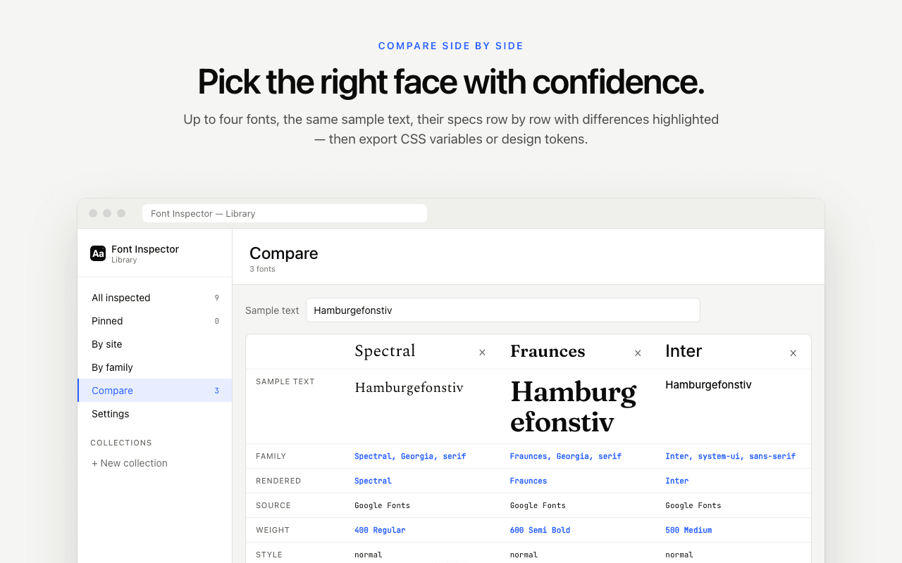
Save the families to your library, then use Compare to set up to four of them side by side with the same sample text. This is where the contrast dimensions from the table above become visible. Over time the library turns into a personal reference of pairings, which you can group into collections and view by site.
Finding a font does not license it. Before you adopt a pairing you discovered, check where each family comes from and what it costs. We cover that in font licensing explained.
Questions & answers
How many fonts should a website use?+
Two families are enough for most sites: one for headings and one for body text. A third is reasonable when it is a monospace for code. More than that usually weakens the design and slows the page.
What is the basic rule of font pairing?+
Contrast in one dimension and harmony in the rest. Pair fonts that clearly differ in structure or weight but share similar proportions, such as x-height and letter width.
Can I pair two sans-serif fonts?+
Yes, if they differ clearly in character or weight, for example a quirky geometric sans for headings and a neutral sans for text. If the two are hard to tell apart, use one family with several weights instead.
What fonts go well together on Google Fonts?+
Dependable starting points are Playfair Display with Source Sans 3, Fraunces with Inter, Space Grotesk with IBM Plex Sans, and DM Serif Display with DM Sans. Superfamilies such as IBM Plex and Source are designed to combine.
How do I find out which fonts a website pairs?+
Inspect a heading and a paragraph in your browser’s DevTools and read the rendered font of each. An extension such as Font Inspector lists every family on the page at once, with the weights and sizes in use.
Related free tools: Font pairing playground · Type scale calculator
Sources and further reading: Google Fonts Knowledge: Pairing typefaces ↗ · Google Fonts: CSS API update (css2) ↗ · web.dev: Best practices for fonts ↗ · MDN: font-family ↗