Use rem for font sizes. It is relative to the root font size, so text follows the reader’s browser font size setting and never compounds. Use em for things that should scale with the text they belong to, such as padding on a button or letter spacing. Use px for details that should not scale with text, such as borders. Page zoom enlarges all three.
The three units in one minute
You inherit a stylesheet. One file sets font-size: 14px, another 0.875rem, a third 1.2em, and nobody remembers why. All three can produce the same pixels on your screen. They differ in what they are relative to, and that decides how they behave when something upstream changes.
| Unit | Relative to | On `font-size` | Follows the browser font size setting? |
|---|---|---|---|
px | Nothing. 1px is 1/96 of a CSS inch | A fixed size | No |
em | A font size nearby | The parent’s font size | Yes, if the chain above it does |
rem | The root element’s font size | The <html> font size | Yes, unless the root is set in px |
A note on px first. A CSS pixel is not a device pixel. On a high-density screen one CSS pixel covers several physical pixels, so 16px text is about the same visual size on a phone and on an old monitor. px is an absolute unit in CSS terms, not a promise about hardware.
Browsers ship with a default font size of 16px, and readers can change it in the browser’s settings. If you never set a font size on <html>, then 1rem equals that setting: 16px for most people, more for someone who has asked for larger text.
em: relative to the font size, and it compounds
em has two meanings, depending on the property.
- On
font-size,1emis the font size the element inherits, which means its parent’s.font-size: 1.5eminside a 16px parent gives 24px. - On every other property,
1emis the element’s own computed font size. Withfont-size: 20px,padding: 1emis 20px.
The first meaning is where trouble starts. Because each em is measured against the parent, nested elements multiply.
html { font-size: 100%; }  /* 16px for most readers */
li   { font-size: 0.875em; }

/* first-level  <li>: 16px  x 0.875 = 14px    */
/* second-level <li>: 14px  x 0.875 = 12.25px */
/* third-level <li>: 12.25 x 0.875 = 10.72px */Nobody wanted 10.72px text. This compounding is the main reason em fell out of favor for font sizes. Replace 0.875em with 0.875rem and every list item is 14px at any depth.
The second meaning is em’s real strength. A button with padding: 0.5em 1em keeps its proportions at any text size. Set the button’s font-size larger and the padding grows with it, with no extra rules. The same goes for letter-spacing, icon sizes next to text and the gap between a label and its field. For the spacing properties, see line height and letter spacing and the letter spacing converter.
rem: relative to the root, and predictable
rem means root em. 1rem is the computed font size of the root element, which in an HTML page is <html>. It ignores everything in between, so nesting never changes it. When rem is used on the root element’s own font-size, it refers to the initial value, the browser’s default.
html  { font-size: 100%; }      /* respect the reader's setting */
body  { font-size: 1rem; }      /* 16px by default */
h1    { font-size: 2.5rem; }    /* 40px by default */
small { font-size: 0.875rem; } /* 14px by default */Converting is a division: rem equals px divided by the root size. With the usual 16px root, 18px is 1.125rem and 24px is 1.5rem. The px to rem converter does it for whole lists of values.
html { font-size: 62.5%; } so that 1rem equals 10px and the arithmetic is easy. It still respects the reader’s setting, because it is a percentage. The cost is that every component must set its own size, and third-party styles written for a 16px root will look small. Most teams now keep the root at 100% and let a tool do the division.Accessibility: zoom versus the font size setting
This part of the debate is often muddled, so it is worth being exact. Readers have two separate ways to make text bigger.
- Page zoom (
CtrlorCmdwith plus) scales the whole page. It enlarges px, em and rem alike. Text set in px does zoom. - The default font size setting, in the browser’s appearance or font settings, changes what the initial font size is. It affects rem, em and percentages. It does not touch a size declared in px.
So px text is not frozen, but it ignores one of the two controls. A reader who set their browser to 20px because 16px is tiring gets 20px body text from 1rem, and still gets 16px from font-size: 16px. They told the browser what they need and the page overruled them.
WCAG Success Criterion 1.4.4, Resize Text, asks that text can be resized up to 200 percent without loss of content or functionality. It does not mandate a unit, and its guidance accepts full-page zoom as a way to meet it. rem is therefore not a strict compliance requirement. It is the choice that honors a preference the reader has already stated, which is the better reason. Resizing is one half of readable text. The other half is color, covered in how to check text contrast.
html { font-size: 16px; }. It cancels the reader’s setting for every rem on the page. Leave the root alone or use a percentage.When px is fine
px is not a mistake everywhere. It is right whenever a measurement should stay put while the text grows.
- Borders, outlines and hairline dividers. A 1px border should stay 1px.
- Box shadows and small corner radii.
- Images and media with intrinsic pixel dimensions.
- Design handoff and discussion. Designers think in px, and that is fine as long as the code converts to rem.
For spacing between blocks, both rem and px are defensible. rem spacing grows with the reader’s font setting and keeps proportions. px spacing keeps more content on screen at large text sizes. Pick one approach and hold to it.
Media queries: em means the browser default
Relative units behave differently inside a media query. The Media Queries specification says relative lengths there are based on the initial value, never on declarations in the page. In practice, 1em and 1rem in a media query both equal the browser’s default font size, including the reader’s preference, and ignore whatever you set on <html>.
/* 48em = 768px at the default 16px.
   At a 20px browser default, this breakpoint moves to 960px. */
@media (min-width: 48em) {
  .layout {
    display: grid;
    grid-template-columns: 16rem 1fr;
  }
}That is usually what you want. Someone with a larger default font has fewer characters per line at any given width, so switching them to the single-column layout earlier keeps lines readable. A px breakpoint is tied to the viewport alone. Note the trap: if you use the 62.5% trick, 48em in a media query is still 768px, not 480px. For sizes that flow with the viewport between breakpoints, see the fluid typography calculator.
A decision table
| What you are sizing | Use | Why |
|---|---|---|
| Body text, headings, UI text | rem | Follows the reader’s setting, never compounds |
Root <html> font size | 100% or leave unset | Keeps the reader’s preference intact |
| Padding and gaps inside a text component | em | Scales with that component’s text |
letter-spacing | em | Tracking should stay proportional to size |
line-height | A unitless number | Inherits as a ratio, not as a fixed length |
| Text that must scale with its parent | em | For example a <small> inside any heading |
| Layout spacing, max widths | rem, or ch for line length | Proportions hold as text grows |
| Borders, shadows, hairlines | px | Should not grow with text |
| Media query breakpoints | em | Responds to the reader’s default font size |
Once units are settled, the sizes themselves should come from a scale, not from taste on the day. How to build a typography scale and the type scale calculator cover that step.
How to read all three on a live site
When you study someone else’s typography, you want both the unit they wrote and the pixels it produced.
- Right-click the text and choose Inspect.
- In the Styles pane, find the winning
font-sizedeclaration. This is the authored value, in whatever unit the developer used:1.125rem,1.2em,clamp(...). - Switch to the Computed tab.
font-sizethere is always resolved to px. That is what the browser is drawing. - To turn px back into rem, select the
<html>element, read its computedfont-size, and divide. For em, divide by the parent element’s computed size instead.
It works, with a little arithmetic per element. Font Inspector shows the size of any text you click in px, em and rem at once, next to the line height in px and as a ratio. Click a value to copy it in the unit you need.
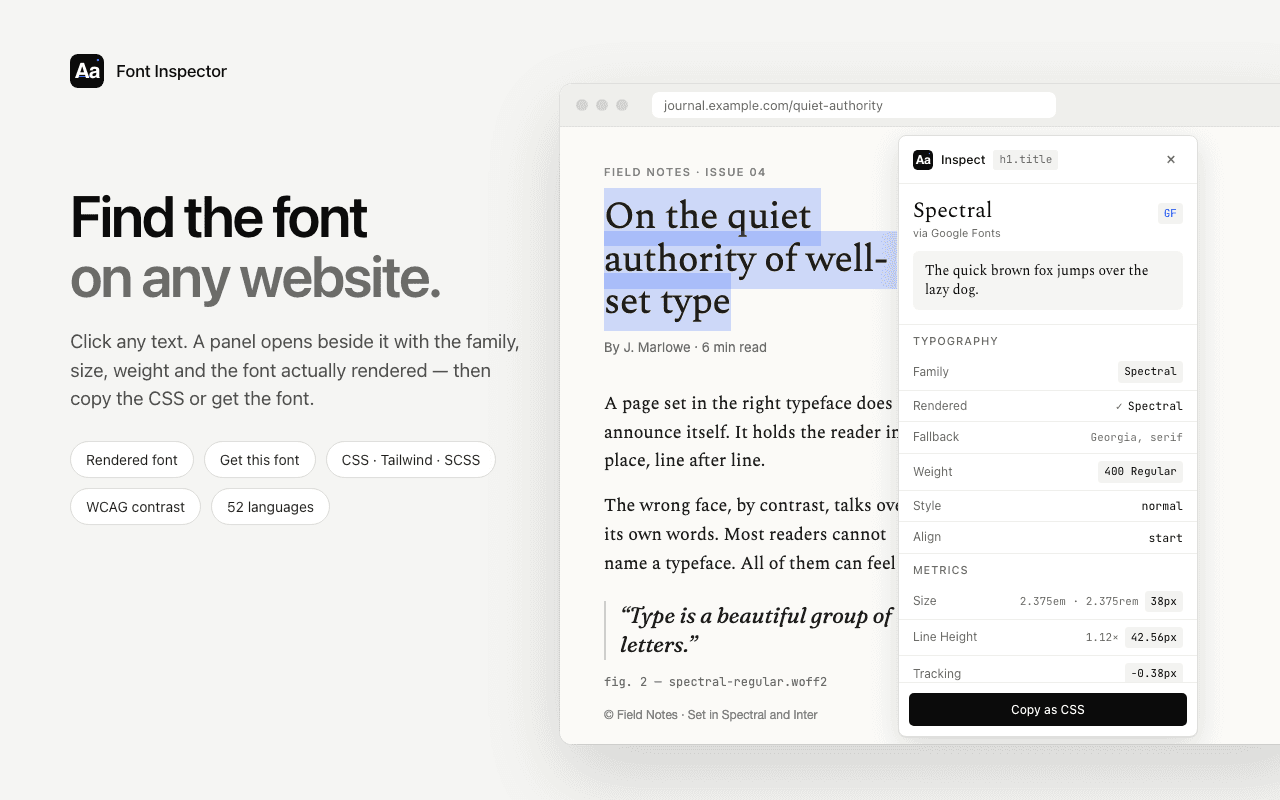
See px, em and rem side by side.
Click any text and Font Inspector shows its size in px, em and rem, plus line height as a ratio. Copy a single value or the whole style as CSS or Tailwind classes. Free, no account.
The full walkthrough is in how to find font size and line height.
Questions & answers
Should I use rem or px for font size?+
Use rem. It scales with the reader’s browser font size setting, while px ignores it. Page zoom enlarges both, so px is not broken, but rem respects a preference the reader has already set.
What is the difference between rem and em?+
rem is relative to the root element’s font size and gives the same result anywhere in the page. em is relative to a nearby font size: the parent’s when used on font-size, and the element’s own for other properties, so nested em values compound.
How many pixels is 1rem?+
It equals the root font size. Browsers default to 16px, so 1rem is 16px unless the reader changed their default font size or the site set a different size on the <html> element.
Should media queries use em, rem or px?+
em is a sound default. In media queries, em and rem are both based on the browser’s default font size, not on your CSS, so em breakpoints adapt for readers who use larger text. px breakpoints react to viewport width only.
Is it bad to set html font-size to 62.5%?+
It is not an accessibility problem, because a percentage still follows the reader’s setting. It can make third-party components look small and forces every element to declare a size, so many teams keep the root at 100%.
Related free tools: PX to REM converter · Type scale calculator · Fluid typography clamp() calculator
See it on real sites: What font does Apple use? · What font does Google use? · What font does Netflix use? · What font does Linear use?
Sources and further reading: MDN: CSS length units ↗ · MDN: font-size ↗ · W3C: Media Queries Level 4, Units ↗ · W3C: Understanding Success Criterion 1.4.4 Resize Text ↗