CSS font weights run from 100 (Thin) to 900 (Black) in steps of 100, with 400 as Regular and 700 as Bold. The keyword normal equals 400 and bold equals 700. If the family has no face at the weight you ask for, the browser picks the nearest available one by a fixed set of rules, or thickens the regular face itself, which is called faux bold.
The scale: nine numbers and their names
A designer hands you a file that says Semi Bold. The CSS wants a number. A font menu says Heavy, the stylesheet says 900, and a Tailwind class says font-black. They can all mean the same thing, and the mapping between them is a convention that most foundries and tools follow.
| Number | Common name | Also called |
|---|---|---|
| 100 | Thin | Hairline |
| 200 | Extra Light | Ultra Light |
| 300 | Light | |
| 400 | Normal | Regular |
| 500 | Medium | |
| 600 | Semi Bold | Demi Bold |
| 700 | Bold | |
| 800 | Extra Bold | Ultra Bold |
| 900 | Black | Heavy |
| 950 | Extra Black | Ultra Black |
Two things are worth knowing about this table. First, the names are a convention, not a rule the browser enforces. CSS only understands the number. A foundry is free to call its 500 face Book or its 800 face Heavy, and some do. Second, the numbers describe a position on a scale, not a stroke thickness. The 700 of one family can look heavier than the 800 of another. When you pair fonts, compare them by eye and not by number.
The 950 row is rare in practice. Most families stop at 900, and many ship far fewer faces: often just 400 and 700.
The keywords: normal, bold, bolder and lighter
font-weight accepts four keywords as well as numbers. Two are fixed aliases: normal is 400 and bold is 700. That is why <strong> and <b> text usually computes to 700, and why headings do too: the browser’s default stylesheet sets them to bold.
The other two, bolder and lighter, are relative to the weight the element inherits from its parent. They do not add or subtract 100. According to MDN, only four weights take part in the calculation: 100, 400, 700 and 900. The result jumps to one of those stops.
| Inherited weight | `bolder` gives | `lighter` gives |
|---|---|---|
| 100 | 400 | 100 |
| 200 | 400 | 100 |
| 300 | 400 | 100 |
| 400 | 700 | 100 |
| 500 | 700 | 100 |
| 600 | 900 | 400 |
| 700 | 900 | 400 |
| 800 | 900 | 700 |
| 900 | 900 | 700 |
The surprise here is lighter. On ordinary 400 text it resolves to 100, not 300. If the family has no Thin face, the matching rules in the next section decide what you actually see. Because the outcome depends on the parent and on the faces available, most design systems avoid the relative keywords and set explicit numbers.
body {
  font-weight: 400; /* same as normal */
}

h1,
strong {
  font-weight: 700; /* same as bold */
}

.card-label {
  font-weight: 600;
}What happens when the weight is missing
Asking for a weight does not create it. If you write font-weight: 600 and the family only has 400 and 700, the browser has to choose. It does so with the font matching algorithm from the CSS Fonts specification, which MDN summarizes as three rules.
- Target from 400 to 500, inclusive. Look first for a face between the target and 500, going up. If there is none, look below the target, going down. If there is still none, look above 500, going up.
- Target below 400. Look for lighter faces first, going down. If there is none, look for heavier faces, going up.
- Target above 500. Look for heavier faces first, going up. If there is none, look for lighter faces, going down.
The short version: bold requests lean heavier, light requests lean lighter, and 400 and 500 stand in for each other. Here is how that plays out for a family that ships only Regular and Bold.
| You ask for | Faces available | You get | Why |
|---|---|---|---|
| 300 | 400, 700 | 400 | Nothing lighter exists, so the search goes up |
| 500 | 400, 700 | 400 | There is no 500 face, so the search goes down before it goes up |
| 600 | 400, 700 | 700 | Above 500, the search goes up first |
| 900 | 400, 700 | 700 | Nothing heavier exists, so the search goes down |
This explains a common confusion. A mockup uses Semi Bold, the developer writes font-weight: 600, and the page shows plain Bold, because the 600 file was never loaded. Nothing looks broken and nothing is logged. MDN adds a detail that makes it harder to spot: the fallback only affects rendering. The computed value stays at 600, so the number in DevTools looks right even when the face on screen is a different weight.
Faux bold and font-synthesis
There is one more thing a browser can do when a family has no bold face at all: make one. It takes the regular outlines and thickens them. This is called faux bold or synthetic bold. The CSS Fonts specification says plainly that the practice is not well loved by typographers, and it is easy to see why. A real Bold is drawn by a designer who adjusts the counters, the spacing and the joins. A synthetic one is the same shapes made fatter. Letters fill in, spacing gets tight, and the text can look slightly smeared.
The classic way to get faux bold by accident is to load a single 400 file for a display font and then use it in an <h1>, which is bold by default. The fix is either to load the real bold face, or to set the heading to font-weight: 400.
You can also switch synthesis off. The font-synthesis property controls which missing styles the browser is allowed to fake: weight, style, small-caps and position. Its default allows all of them. Setting it to none, or setting the longhand font-synthesis-weight to none, tells the browser to draw the real face it has and stop there.
@font-face {
  font-family: "Showcase Display";
  src: url("/fonts/showcase-display-regular.woff2") format("woff2");
  font-weight: 400;
  font-style: normal;
  font-display: swap;
}

h1 {
  font-family: "Showcase Display", Georgia, serif;
  font-weight: 400;
  font-synthesis-weight: none;
}MDN points out that synthesis is a particular problem for Chinese, Japanese, Korean and other logographic scripts, where fonts tend not to include these variants and faking them can hurt legibility. If your site serves those languages, turning synthesis off for them is a sensible default.
Variable fonts: every weight between the stops
The nine stops exist because static fonts come as separate files. A variable font holds a continuous weight axis in one file, and CSS supports that directly: font-weight accepts any number from 1 to 1000. With a variable family, 450 or 625 is a real weight and not a request that gets rounded.
To make it work, the @font-face rule declares the range the file covers, using two numbers. The browser maps font-weight to the font’s wght axis for you.
@font-face {
  font-family: "Inter";
  src: url("/fonts/inter-variable.woff2") format("woff2");
  font-weight: 100 900;
  font-style: normal;
  font-display: swap;
}

.lede {
  font-weight: 450;
}

.button {
  font-weight: 625;
}@font-face makes every value inside it available.Two cautions. The range you declare should match what the file supports: if the axis stops at 700, a request for 900 cannot be heavier than 700. And in-between weights only exist for variable fonts. On a static family, 450 runs through the matching rules above and lands on a neighboring face. Intermediate weights are most useful for fine tuning, for example nudging a button label until it balances with the icon next to it.
Tailwind class names for each weight
Tailwind CSS names its font weight utilities after the same convention, with the spaces removed. If you are translating a design into classes, this is the whole list.
| Class | CSS |
|---|---|
font-thin | font-weight: 100 |
font-extralight | font-weight: 200 |
font-light | font-weight: 300 |
font-normal | font-weight: 400 |
font-medium | font-weight: 500 |
font-semibold | font-weight: 600 |
font-bold | font-weight: 700 |
font-extrabold | font-weight: 800 |
font-black | font-weight: 900 |
For a weight between the stops, Tailwind accepts an arbitrary value in square brackets, such as font-[450]. The class only sets the number. Whether you see that weight still depends on the faces the page has loaded, exactly as with hand-written CSS. There is more on moving styles between formats in copy typography as CSS or Tailwind.
How to check the weight a page really uses
When you want to know what weight a heading on a live site uses, the browser can tell you.
- In Chrome or Edge, right-click the text and choose Inspect.
- Open the Computed tab in the Elements panel and find
font-weight. Keywords are resolved here, soboldshows as 700 andboldershows as the number it worked out to. - Scroll to Rendered Fonts at the bottom of the same tab. It names the font actually used and says whether it is a network resource or a local file.
- Open the Network panel, filter to Font and reload. The list shows which font files the page downloaded. If the computed weight is 600, no semi bold file is in the list and the family is not variable, you are looking at a neighboring face or a synthetic one.
In Firefox, the Fonts tab of the Inspector shows the fonts used by the selected element, with sliders for the axes when the font is variable. The full walkthrough is in find a font with Chrome DevTools.
The number alone sends you back to a table like the one at the top of this page. Font Inspector removes that step. Pick any text and the panel shows the weight as a number and a name together, for example 600 next to Semi Bold, along with the family, the font actually rendered, the size and the line height. Fonts on this page lists every family with the weights it is used at, which is a quick way to see how many weights a site really relies on.
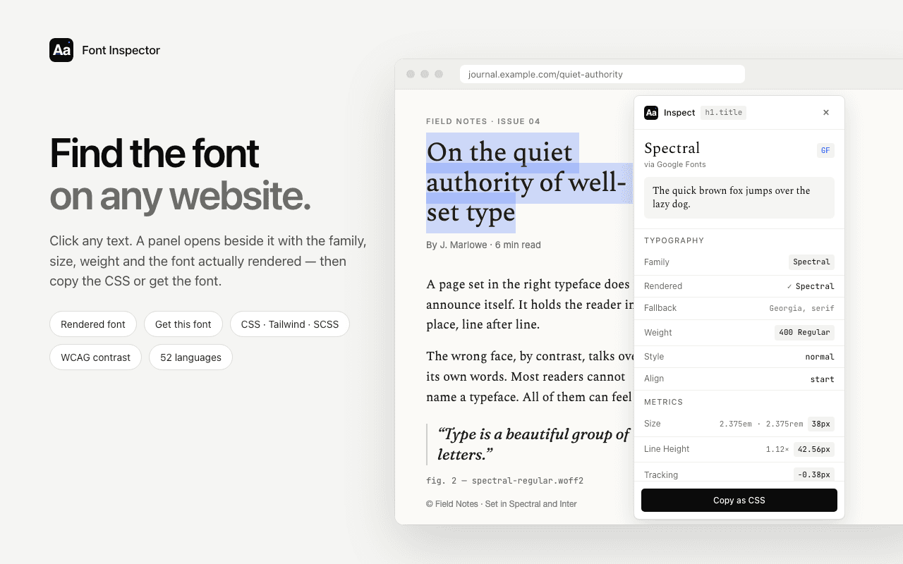
See the weight as a number and a name.
Font Inspector shows the weight of any text on a page as both its number and its common name, next to the font that is actually rendered. Click the value to copy it. Free, no account.
Questions & answers
What number is font-weight bold?+
bold is exactly 700, and normal is exactly 400. The two keywords are aliases for those numbers and behave identically to them.
What font weight is semi bold?+
Semi Bold, also called Demi Bold, is 600. Medium is 500 and Bold is 700, so Semi Bold sits between them.
Why does font-weight: 600 look the same as 700?+
The family probably has no 600 face loaded. For weights above 500 the browser looks for the next heavier face first, so with only 400 and 700 available, 600 shows as 700 and 500 shows as 400.
What is faux bold?+
Faux bold is a bold the browser makes itself by thickening the regular face when the family has no real bold. It usually looks cruder than a designed bold. Load the real bold file, or turn it off with font-synthesis-weight: none.
Can I use font-weight values like 450 or 550?+
Yes. CSS accepts any number from 1 to 1000. You only see a true in-between weight with a variable font whose weight axis covers that value. With static fonts the browser picks the nearest available face.
Related free tools: @font-face generator · Website font checker
See it on real sites: What font does Discord use? · What font does OpenAI use? · What font does Claude use? · What font does Anthropic use?
Sources and further reading: MDN: font-weight ↗ · MDN: font-synthesis ↗ · W3C: CSS Fonts Module Level 4 ↗ · Tailwind CSS: font-weight ↗