 font inspector
A system font stack tells the browser to use the font the operating system already uses for its own interface, so nothing is downloaded. The modern form is font-family: system-ui, sans-serif. It gives San Francisco on Apple devices, Segoe UI on Windows and Roboto on Android. The text looks native and renders at once, but it looks different on every platform, and system-ui has known problems for long text and for some CJK setups on Windows.
Why use the fonts that are already there
Every web font is a download that has to finish before your text looks the way you designed it. Until then the browser either hides the text or shows a fallback and swaps later, which is the whole subject of font-display and of layout shift from web fonts. A system font stack sidesteps all of it. The fonts are on the device before the page is requested.
- No font requests. Nothing to download, preload, subset or cache.
- No flash and no swap. The first paint is the final paint, so fonts cannot cause a layout shift.
- Native feel. Text matches the menus, dialogs and apps around the browser window.
- No third party. No request goes to a font host, which also settles the privacy question covered in self-hosting Google Fonts.
The price is control. You do not choose one typeface. You choose a different one for each operating system, and you accept whatever each platform provides.
What system-ui resolves to on each platform
system-ui is a generic font family, like serif or monospace. The CSS Fonts specification defines it as the default user interface font of the platform the browser is running on. It is a keyword, so it is written without quotes.
| Platform | Typical system UI font |
|---|---|
| macOS, iOS, iPadOS | San Francisco |
| Windows | Segoe UI |
| Android | Roboto |
| Linux | Depends on the distribution and desktop, for example Cantarell or Ubuntu |
That last caption matters. The specification says the font used depends on platform support, platform language, locale settings, user preferences and the content language. system-ui is a request for whatever the interface font is on this machine, not a promise of a particular typeface.
All current browsers support the keyword. According to Can I use, that means Chrome from version 56, Safari from 11 and Firefox from 92.
The long classic stack and the short modern one
Before system-ui was widely supported, the only way to get the same result was to name each platform’s font in turn. You will still find this stack on many sites and in many CSS frameworks.
body {
  font-family: -apple-system, BlinkMacSystemFont, "Segoe UI", Roboto,
    Oxygen-Sans, Ubuntu, Cantarell, "Helvetica Neue", Arial, sans-serif;
}It works because of how a font stack is read: the browser takes the first family it can find on the device and ignores the rest. -apple-system and BlinkMacSystemFont are older, browser-specific ways of asking for San Francisco in Safari and in Chrome on macOS. Segoe UI catches Windows, Roboto catches Android, and Oxygen-Sans, Ubuntu and Cantarell catch common Linux desktops. Helvetica Neue and Arial are there for anything older, and sans-serif is the final safety net. The mechanics are explained in CSS font stacks and fallbacks.
Today the same intent fits on one line.
body {
  font-family: system-ui, sans-serif;
}A middle road is to put system-ui first and keep a few named fonts after it for old browsers. There is one real difference between the approaches. A named font such as Roboto matches any device where a font with that name is installed, including a desktop computer where the user installed it themselves. system-ui always follows the operating system. You can assemble either version in the font stack builder.
ui-serif, ui-sans-serif, ui-monospace and ui-rounded
The same specification defines four more keywords for the other faces of a platform’s interface: ui-serif, ui-sans-serif, ui-monospace and ui-rounded. On Apple platforms they map to the serif, monospaced and rounded companions of San Francisco.
Support is the catch. According to Can I use, only Safari supports these keywords, from version 13.1 on macOS and 13.4 on iOS. Chrome, Edge and Firefox do not. The specification also says they are not expected to map to any font on platforms that have no suitable system font. An unsupported keyword is simply skipped, so they are safe to use as long as real fallbacks follow.
code,
pre {
  font-family: ui-monospace, Menlo, Consolas, "Liberation Mono", monospace;
}

.article {
  font-family: ui-serif, Georgia, "Times New Roman", serif;
}

.badge {
  font-family: ui-rounded, system-ui, sans-serif;
}ui- keyword. Every other browser moves on to the next family in the list.Never end a stack on a ui- keyword. Treat them as a small improvement for Apple devices, not as a cross-platform tool.
Known caveats of system-ui
system-ui has two documented problems, and both are stated on MDN.
- It is meant for interfaces, not for long reading. MDN notes that
system-uiis intended to make UI elements look like native apps, not to typeset large paragraphs of text, and recommendssans-serifor another non-UI family for long passages. - It follows the system language, not your page. On Windows set to a Chinese, Japanese or Korean locale, the interface font is a CJK font. MDN warns that the default Windows CJK font may render Latin text poorly, and that the
langattribute may not change the font that is shown. The specification gives matching examples, such as content marked as Japanese on a system set to a Chinese locale.
MDN adds a third, quieter point: some operating systems do not let users customize system-ui, while browsers generally do let them choose their sans-serif font. A reader who picked a font because it is easier for them to read gets that choice respected by sans-serif and not by system-ui.
A practical way around the locale problem is to name the Latin fonts before the keyword. A named family is matched by name, whatever the system language is.
body {
  font-family: -apple-system, BlinkMacSystemFont, "Segoe UI", system-ui,
    sans-serif;
}Segoe UI by name before system-ui is consulted.Characters that the named font does not contain still fall through to the later entries one by one, so text in other scripts keeps rendering.
Emoji fonts at the end of the stack
Many system stacks end with a run of emoji font names after the generic keyword.
body {
  font-family: system-ui, sans-serif, "Apple Color Emoji", "Segoe UI Emoji",
    "Segoe UI Symbol", "Noto Color Emoji";
}Font fallback works per character. When the main font has no glyph for a character, the browser walks down the list until it finds a font that does. Browsers will find an emoji font without help, so these names are not required. Listing them makes the choice explicit: the platform’s color emoji font is used, rather than a monochrome symbol from some other font that happens to cover the same character.
It also means a single line of text can be drawn by two or three fonts. That is normal, and worth remembering when you inspect a page and the rendered font seems to change in the middle of a sentence.
When a system stack is the right call
| Situation | System stack? | Reason |
|---|---|---|
| Web apps, dashboards, admin tools | Yes | Interface text is exactly what system-ui is designed for |
| Documentation and internal tools | Yes | Speed and clarity matter more than brand |
| Pages where performance is critical | Yes | No font requests and no font-related layout shift |
| Fallback behind a web font | Yes | A good last resort at the end of any stack |
| Brand and marketing sites | Usually not | The typeface is part of the identity and should be the same everywhere |
| Long-form reading | With care | Prefer sans-serif or a chosen text face, as MDN suggests |
| Layouts that must match across platforms | No | Each system font has different widths, so lines break differently |
The last row is the one that catches people. San Francisco, Segoe UI and Roboto have different proportions. A headline that fits on one line on a Mac can wrap on Windows. If you use a system stack, design with flexible containers and test on more than one platform. If you like the look of a particular system font and want it everywhere, the alternatives pages list free web fonts that come close.
How a system font site looks when you inspect it
Sites that use a system stack can be puzzling to inspect, because the font you see is not named anywhere in the CSS. Here is how to confirm it by hand.
- In Chrome or Edge, right-click the text, choose Inspect and open the Computed tab.
font-familyshows the declared stack, withsystem-uior a list that starts with-apple-system, BlinkMacSystemFontat the front. - Scroll to Rendered Fonts at the bottom of the tab. It names the font actually used and marks it as a local file instead of a network resource.
- Open the Network panel, filter to Font and reload. If the list stays empty, the page downloads no fonts at all.
One thing to keep in mind: the result describes your machine. The same page shows Segoe UI to a Windows visitor and San Francisco to someone on a Mac, and DevTools can only report the one in front of you. The browser-by-browser steps are in how to identify fonts on a website.
Font Inspector reports the same facts in one click. Pick any text and the panel shows the full declared stack, the font actually rendered, and the source of each family. For a system stack the source reads as a system font installed on the device, instead of Google Fonts, Adobe Fonts or a self-hosted web font. Fonts on this page lists every family the page uses, and you can inspect any of them from there to see its source.
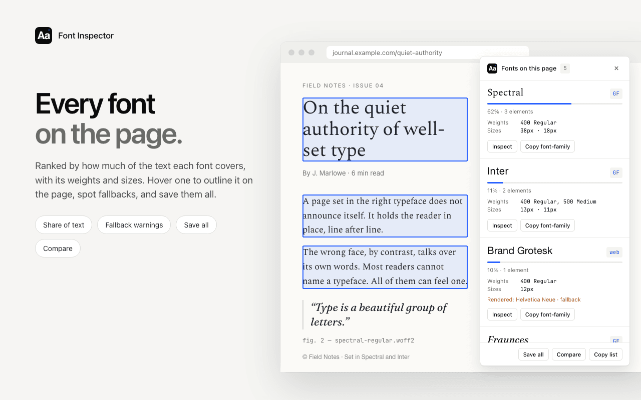
See where every font comes from.
Font Inspector shows the source of each family in a stack: Google Fonts, Adobe Fonts, a self-hosted web font, or a system font installed on the device. It also names the font actually rendered. Free, no account.
Questions & answers
What is a system font stack?
It is a font-family value that uses the fonts already installed with the operating system, so the page downloads no font files. The modern version is font-family: system-ui, sans-serif.
What font does system-ui use?
It uses the platform’s interface font: San Francisco on macOS and iOS, Segoe UI on Windows, Roboto on Android, and a distribution-specific font on Linux. The exact result can change with the OS version, language and user settings.
Is system-ui supported in all browsers?
Yes, in all current ones. Can I use lists support from Chrome 56, Safari 11 and Firefox 92. Add sans-serif after it as a fallback for anything older.
Do ui-serif, ui-monospace and ui-rounded work in Chrome?
No. According to Can I use, only Safari supports them. Other browsers skip the keyword and use the next family in the stack, so always list real fallbacks after it.
Are system fonts better for performance?
They remove font downloads completely, so text renders at once and fonts cannot cause a layout shift. The trade-off is that the typeface differs from platform to platform.
Related free tools: CSS font stack builder · Website font checker
See it on real sites: What font does Anthropic use? · What font does X (Twitter) use? · What font does YouTube use? · What font does TikTok use?
Sources and further reading: MDN: font-family · W3C: CSS Fonts Module Level 4, generic font families · Can I use: system-ui value for font-family · Can I use: ui-serif, ui-sans-serif, ui-monospace and ui-rounded · CSS-Tricks: System Font Stack